
Visual branding holds a quiet power that goes far beyond mere decoration. A single image can signal values, spark recognition, and shape how entire generations perceive a company. Over decades, certain logos have done more than identify products. They have mirrored the times in which they appeared.
These designs often emerge from specific moments in history yet manage to feel timeless. Their success lies in simplicity paired with deeper resonance. When a logo captures the spirit of its era while remaining adaptable, it becomes something larger than the brand itself.
The Nike Swoosh
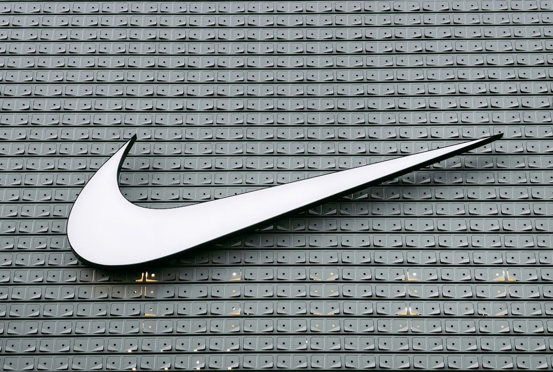
The Nike Swoosh first appeared in 1971 as a simple checkmark shape. It was meant to suggest motion and speed without any words attached. The design drew from the Greek goddess of victory, giving it an ancient root that felt fresh in the modern sports world.
Over time the mark grew into a symbol of personal achievement and athletic drive. It appeared on shoes worn by record breakers and everyday runners alike. The logo helped turn Nike from a small Oregon startup into a global force that redefined how people think about fitness and self improvement.
The Apple Logo
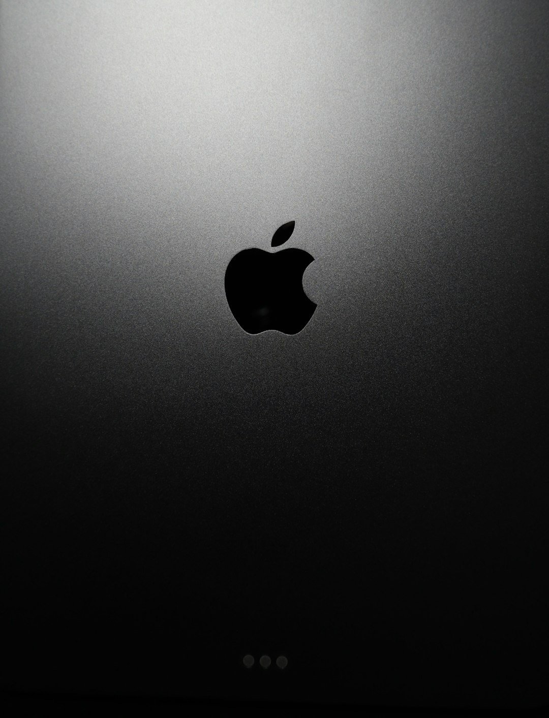
Apple introduced its bitten apple logo in 1977 during the early days of personal computing. The design stood out with its rainbow stripes at first, later simplified to a single color. The bite was added to prevent confusion with other fruit shapes and to play on the word byte in computing.
The logo came to represent creativity and user friendly technology at a time when computers felt intimidating to most people. It helped position Apple as an approachable innovator rather than a cold machine maker. Today the mark remains one of the most recognized symbols of design and lifestyle integration.
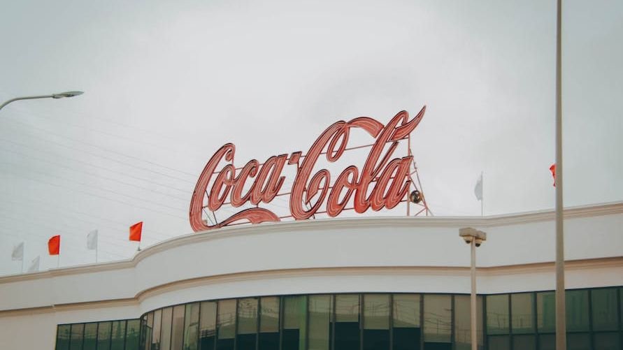
The Coca Cola Script
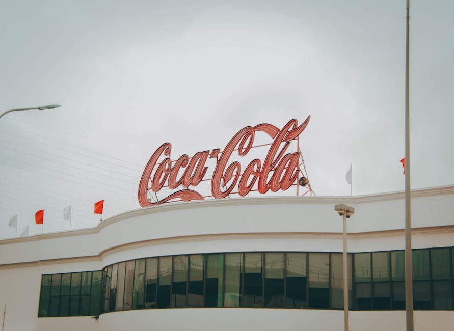
The Coca Cola script logo dates back to 1887 and has changed very little since then. Its flowing cursive letters were chosen to feel friendly and inviting on bottles and signs. The design reflected the era of emerging mass advertising and the rise of consumer culture in America.
Over more than a century the mark has stayed consistent while the world around it transformed. It became tied to moments of celebration, refreshment, and shared experience across continents. The logo helped make Coca Cola not just a drink but a familiar presence in daily life and popular memory.
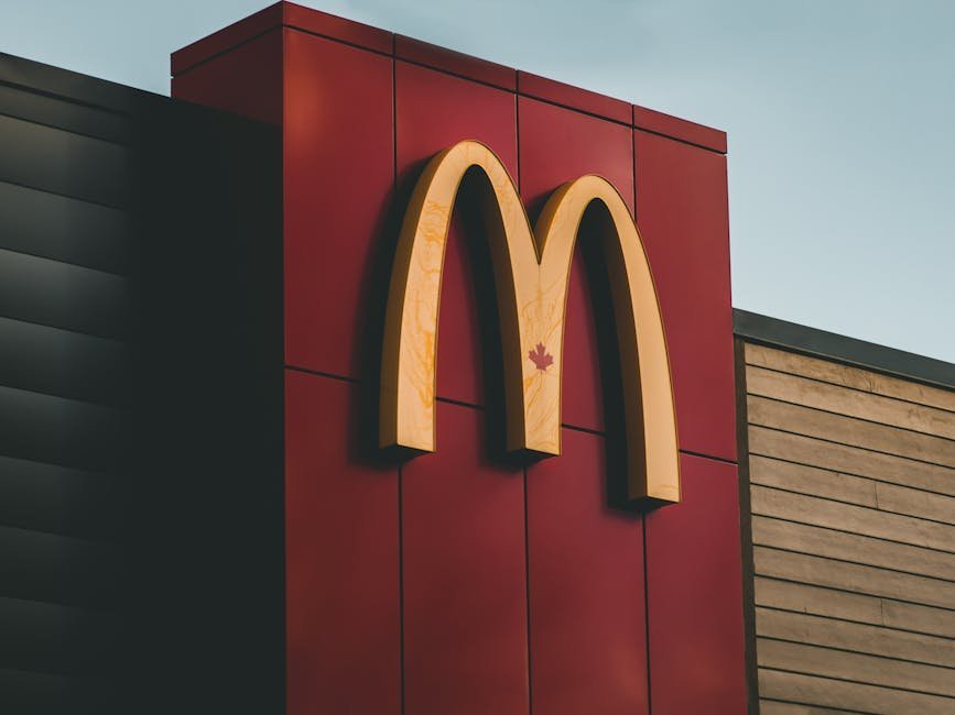
The McDonald’s Golden Arches
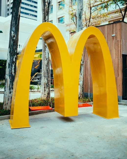
McDonald’s adopted the Golden Arches in 1962 as part of its push into roadside dining. The twin arches formed an M that was easy to spot from a distance on highways. The bright yellow color stood out against the landscape of the growing car culture era.
The design captured the optimism and speed of postwar America where convenience became a priority. It turned the restaurant into a landmark that families recognized instantly. The arches helped McDonald’s expand from a regional chain into a worldwide symbol of fast food and American influence abroad.
The Starbucks Siren
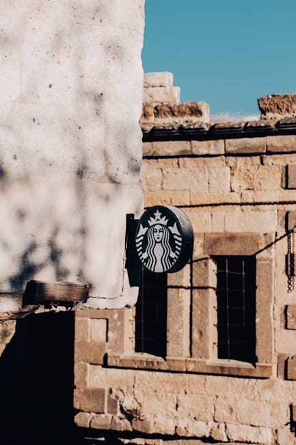
Starbucks introduced its siren logo in 1971 when the first store opened in Seattle. The image drew from old nautical charts and represented the seafaring roots of coffee trade. The original version showed more of the figure before later versions cropped it for simplicity.
The mark grew alongside the rise of specialty coffee and the idea of the cafe as a third place between home and work. It signaled quality and a certain lifestyle choice at a time when people began seeking better daily experiences. The logo helped Starbucks become a global gathering spot that shaped urban routines and social habits.
The Google Logo
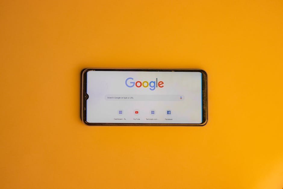
Google launched its multicolored logo in 1998 during the early internet boom. The playful mix of primary colors and a single secondary one reflected the company’s aim to make search feel approachable and fun. Slight updates over the years kept the core look while improving clarity on screens.
The design arrived as the web shifted from technical tool to everyday resource for millions. It helped Google stand out in a crowded field of search engines by appearing friendly rather than corporate. The logo became shorthand for finding answers quickly and shaped how people navigate information in the digital age.
Logos as Enduring Cultural Markers
These logos have moved beyond their original commercial purpose to become shared reference points in daily conversation and media. People recognize them instantly even when the brand name is absent. They appear in art, fashion, and everyday objects as shorthand for larger ideas about success, comfort, or innovation.
Over time the marks gain layers of meaning from the events and attitudes of each decade. They connect personal memories with collective history in ways that few other visual elements can match. In this way iconic logos continue to define not only the companies they represent but also the eras that shaped them.
