

For any feedback please reach out to info@festivalinside.com
- 25 Festival Moments So Wild They Changed Event History - July 26, 2026
- 20 Classic Novels People Say They’ve Read (But Usually Haven’t) - July 26, 2026
- The Greatest Comebacks in American Literary History - July 25, 2026
The Trust Factor: Blue

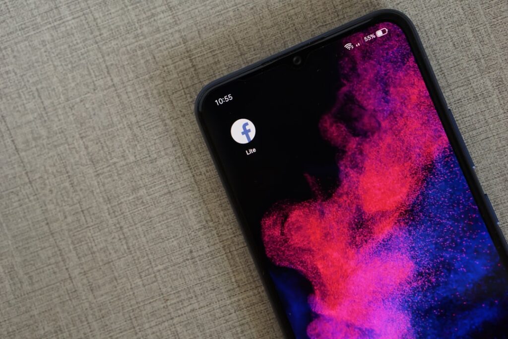
Blue is a prevalent color in app design, and it’s not by accident. This color is often linked with trust, calmness, and reliability. Research shows that blue is universally liked, making it a safe choice for many brands. According to the Institute for Color Research, people make a subconscious judgment about a person, environment, or product within 90 seconds, and between 62% to 90% of that assessment is based on color alone. This is why many financial institutions and social media platforms, like Facebook, utilize blue in their branding. The calming effect of blue can also help reduce anxiety in users, making them more likely to engage with the app. It’s a color that whispers, “You can trust me,” making it a cornerstone in the world of app design.
The Urgency of Red

Red is the color of urgency and importance. It commands attention and is often used in alerts and notifications to prompt immediate action from users. For instance, apps frequently use red to indicate critical updates or to highlight important messages. A study conducted by the University of Rochester found that red can increase a person’s reaction time, making it an effective choice for notifications. However, red should be used sparingly, as overuse can lead to desensitization. Apps like Instagram and YouTube utilize red strategically to draw users’ eyes to key features or updates. Red is like a loud alarm—effective but best used in moderation.
Green for Success and Safety

Green is a color that often symbolizes success, safety, and money. It represents growth and prosperity, making it a popular choice for financial apps and health-related platforms. According to a survey by Color Psychology, 73% of people associate green with safety, which is why many health and wellness apps use this color to create a sense of security. Additionally, green is easy on the eyes, making it a comfortable choice for prolonged use. Brands like Spotify and WhatsApp effectively use green to convey their core values of growth and connection. Green serves as a gentle reminder of success and well-being, providing users with a sense of assurance.
The Attention-Grabbing Power of Yellow

Yellow is bright and cheerful, naturally grabbing attention. However, it is often used sparingly in app design due to its overwhelming nature. When used correctly, yellow can highlight important features or calls to action. Research indicates that yellow can stimulate mental activity and generate feelings of happiness. However, too much yellow can lead to visual fatigue, which is why it is typically used as an accent color. Apps like Snapchat utilize yellow effectively to create a fun and engaging user experience without overwhelming users. Yellow is like a spotlight, shining brightly but best used in small doses.
The Importance of Black and White

Black and white color schemes are essential for ensuring readability and contrast in app design. These colors provide a clean and minimalist aesthetic that enhances user experience. According to a study by the Nielsen Norman Group, high contrast between text and background improves readability, making it easier for users to navigate the app. Many successful apps, such as Apple’s Notes and Google’s Keep, use black and white to create a streamlined interface that allows users to focus on content without distractions. Black and white work like a classic black-tie event—simple yet elegant.
The Modern Appeal of Muted Palettes

Muted color palettes have gained popularity in recent years as they convey a modern and minimalistic aesthetic. These palettes often consist of soft, desaturated colors that create a calming effect. Research suggests that muted colors can enhance user engagement by reducing visual clutter and allowing users to focus on essential elements. Apps like Pinterest and Airbnb utilize muted palettes to create a sophisticated and inviting atmosphere that encourages exploration and creativity. Muted colors are like a soothing whisper, inviting users to linger and explore.
Accessibility Through High Contrast

High contrast color schemes are crucial for improving accessibility in app design. According to the Web Content Accessibility Guidelines (WCAG), sufficient contrast between text and background colors is necessary for users with visual impairments. A study by the American Foundation for the Blind found that users with low vision benefit significantly from high contrast interfaces. Many apps, including those in the health and finance sectors, prioritize high contrast to ensure that all users can navigate their platforms effectively. High contrast is like a guiding light, making sure everyone finds their way.
Intuitive Navigation with Color Schemes

Color schemes play a vital role in supporting intuitive navigation within apps. Users often associate specific colors with particular actions, such as red for delete or green for confirm. This learned behavior helps streamline the user experience, as users can quickly identify what actions to take based on color cues. Research from the Interaction Design Foundation indicates that consistent use of color across an app can significantly reduce the learning curve for new users, making it easier for them to navigate and engage with the platform. Color schemes act like a map, guiding users effortlessly through the app.
The Influence of Design Guidelines

Many apps adhere to established design guidelines, such as Google’s Material Design and Apple’s Human Interface Guidelines (HIG). These guidelines provide a framework for color usage, ensuring consistency and familiarity across different platforms. According to a report by the Nielsen Norman Group, following these guidelines can lead to improved user satisfaction and engagement. By utilizing familiar color schemes, apps can create a seamless experience that resonates with users and encourages continued use. Design guidelines are like a recipe, ensuring the final product is both familiar and delightful.
The Role of Color Psychology in User Behavior

Color psychology plays a significant role in influencing user behavior and engagement. Research indicates that colors can evoke specific emotions and reactions, which can impact how users interact with an app. For example, studies show that blue can enhance feelings of trust, while red can create a sense of urgency. By understanding the psychological effects of color, app designers can create interfaces that not only look appealing but also drive user action. Brands that effectively leverage color psychology, such as Spotify and Netflix, often see higher engagement and retention rates. Color psychology acts as an invisible hand, gently guiding user actions and emotions.

Christian Wiedeck, all the way from Germany, loves music festivals, especially in the USA. His articles bring the excitement of these events to readers worldwide.
For any feedback please reach out to info@festivalinside.com
