

- 20 Misprints or Errors That Changed What We Believe - July 22, 2026
- 14 Opening Chapters That Grabbed Readers and Never Let Go - July 22, 2026
- 20 Forgotten Rituals That Defined Entire Civilizations - July 22, 2026
Album covers began as modest labels on 78-rpm singles, mainly serving practical purposes like artist identification. The introduction of the 12-inch LP format in the late 1940s expanded the canvas dramatically. By the 1960s, musicians and designers seized this opportunity to fuse visual art with sound, creating symbols that amplified themes of rebellion, psychedelia, and introspection.
This evolution peaked with collaborations between bands and visionary studios like Hipgnosis. Covers became inseparable from the music’s identity, sparking discussions and myths that endured beyond sales charts. They transformed records into cultural artifacts, where imagery whispered secrets about the songs within.[1][2]
Pink Floyd – The Dark Side of the Moon

Storm Thorgerson of the design collective Hipgnosis crafted a stark black background pierced by a white beam entering a triangular prism. The light refracts into a rainbow spectrum, evoking scientific precision amid cosmic mystery. This simple yet profound image captures refraction’s elegance, mirroring the album’s exploration of time, madness, and mortality.
The prism symbolizes the band’s desire for sonic clarity and diversity, contrasting the hazy drug culture of the era. A heartbeat pulse bookends the record, tying back to the visual heartbeat of light splitting. Culturally, it stands as one of rock’s most recognizable icons, endlessly parodied and analyzed for its layered depth.[1][2]
The Beatles – Abbey Road
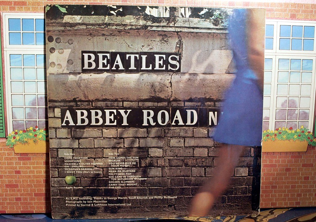
Iain Macmillan snapped the band mid-stride across a London zebra crossing, with John in white, Ringo in black, Paul barefoot in a suit, and George trailing in denim. The Volkswagen Beetle’s license plate reads “28 IF,” fueling endless speculation. This unposed shot on a public street became the blueprint for casual rock iconography.
Paul’s bare feet sparked the “Paul is Dead” conspiracy, interpreted as a corpse marker in funeral processions, while his left-handed stance and out-of-step walk added layers. The image marked the band’s swan song, blending everyday realism with morbid myth. Its cultural ripple endures in memes and pilgrimages to the site, cementing Abbey Road’s place in pop history.[2]
Joy Division – Unknown Pleasures

Designer Peter Saville flipped colors from a Cambridge astronomy encyclopedia, rendering pulsar CP 1919’s radio waves as white zigzags on black. No band name or title appears, heightening anonymity. This stark, futuristic graphic evokes radio signals from distant stars, pulsing with isolation.
The waves symbolize emotional turbulence and cosmic detachment, aligning with Ian Curtis’s anguished lyrics. Saville’s minimalist choice captured post-punk’s raw nerve. The cover influenced graphic design profoundly, from streetwear to tattoos, embodying the genre’s haunting legacy.[2]
Nirvana – Nevermind

Kurt Cobain envisioned a baby swimming toward a dollar bill on a fishhook, photographed underwater by Kirk Weddle with infant Spencer Elden. The child’s nudity and determined chase dominate the bright blue scene. This visceral image distills grunge’s raw energy into a single frame.
It critiques consumerism’s grip from birth, the bill dangling like false promise. Debates over the penis led to censorship threats, yet it propelled the album’s breakthrough. Nevermind’s artwork reshaped alternative rock visuals, spawning parodies and lawsuits that underscore its provocative staying power.[1][2]
The Velvet Underground & Nico
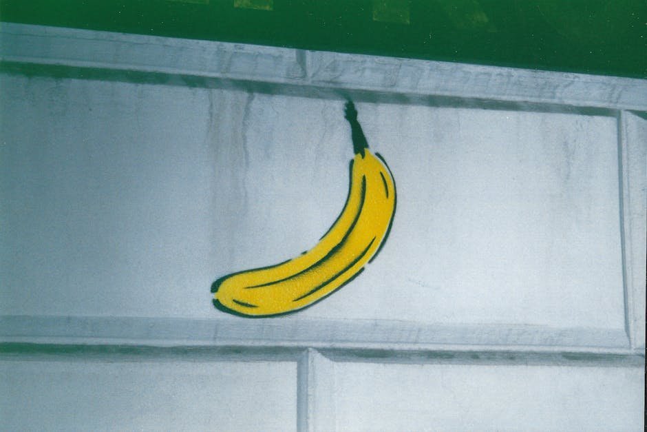
Andy Warhol hand-painted a pink banana against yellow on the debut, with early pressings featuring a peel-back sticker revealing flesh-toned fruit beneath. His pop art flair turned the sleeve into interactive provocation. The fruit’s phallic curve screams sexuality amid the album’s gritty themes.
Warhol’s involvement elevated underground rock, the peel symbolizing temptation and revelation. Production delays and his marketing stamped it as avant-garde legend. This cover birthed artist-musician partnerships, inspiring punk aesthetics and collectible reissues.[1]
The Rolling Stones – Sticky Fingers
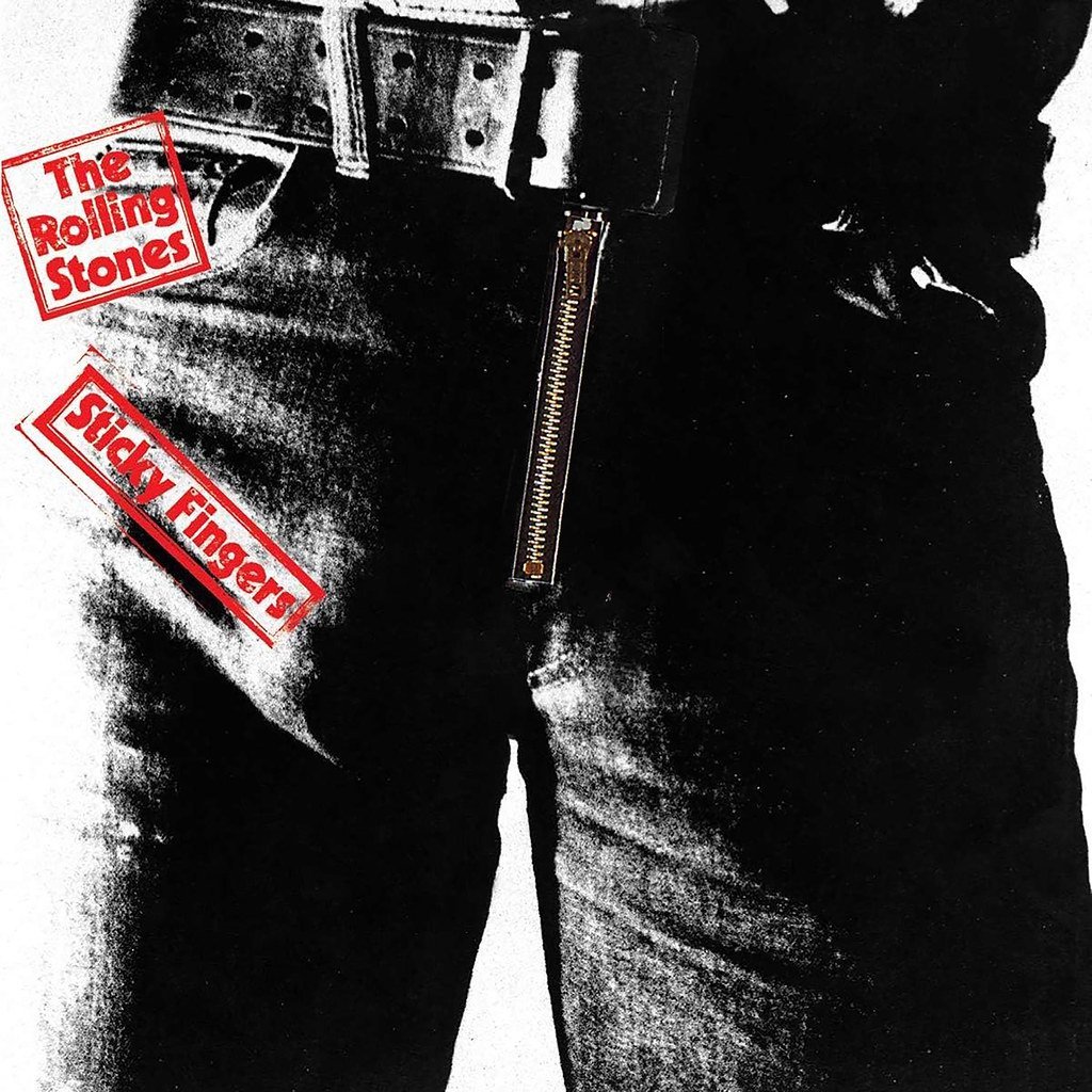
Andy Warhol photographed model Joe Dallesandro’s crotch in tight jeans, complete with a real zipper that unzipped to reveal white briefs. John Pasche’s tongue logo debuted here, curling defiantly. The dual-sided design demanded innovative printing to avoid damaging inner sleeves.
The zipper embodies rock’s tactile rebellion and sexual bravado, challenging norms boldly. Postal services complained about jams from the functional element. Sticky Fingers fused fashion, scandal, and commerce, its imagery enduring as Stones shorthand.[1]
The Beatles – Sgt. Pepper’s Lonely Hearts Club Band
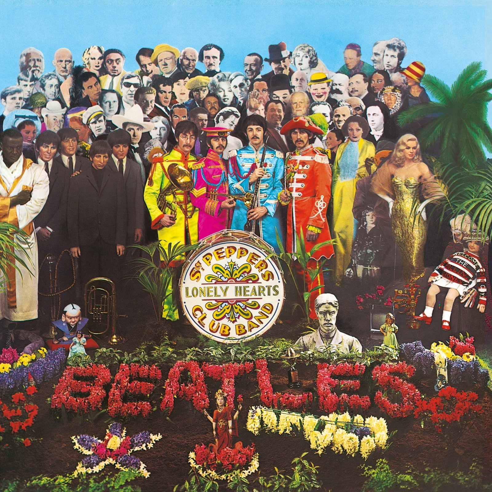
Photographer Michael Cooper assembled a collage of 70 celebrities, from Marilyn Monroe to Gandhi, with wax Beatles figures upfront. Artists Peter Blake and Jann Haworth orchestrated the floral “BEATLES” bed and eclectic props. This psychedelic garden burst with 1967’s cultural mosaic.
It celebrates communal creativity, hiding nods like a “Welcome the Rolling Stones” doll as playful rivalry. The design prioritized art over commerce, signaling rock’s maturity. Sgt. Pepper redefined sleeves as gallery walls, influencing countless homages.[1]
King Crimson – In the Court of the Crimson King
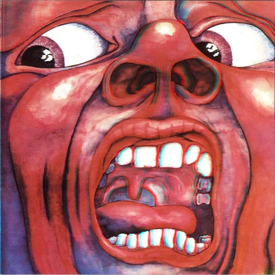
Barry Godber, a computer programmer and artist, painted a humanoid face contorted in primal scream against fiery red. Its bulging eyes and bared teeth dominate the canvas starkly. Godber’s sole artwork captured prog rock’s epic unease before his sudden death.
The visage embodies paranoia and existential dread, echoing the album’s orchestral fury. Minimalist yet intense, it set visual tone for progressive experimentation. This cover endures as a prog cornerstone, its raw emotion haunting listeners decades later.[2]
Led Zeppelin – Led Zeppelin IV
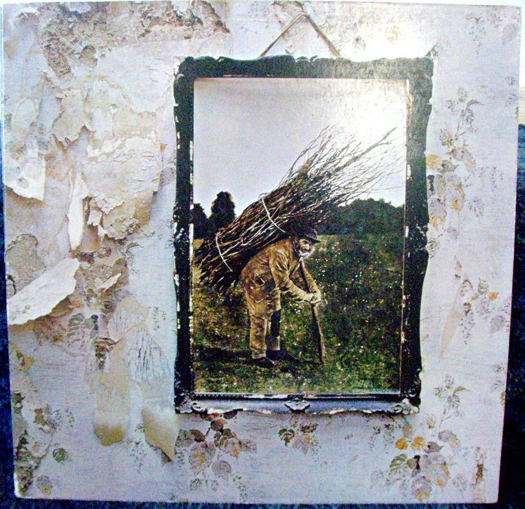
An ancient hermit bears a glowing lantern up craggy slopes, rendered in intricate line art by unnamed designer, framed by mysterious runes. The gatefold’s tapestry hides mirrored demons and beasts when flipped. No title or band name appears, relying on symbols alone.
Runes represent personal sigils for each member, drawing from mysticism and tarot’s Hermit card for inner wisdom. It evokes folklore and the occult, matching epic riffs. The untitled sleeve pioneered enigmatic branding, its myths fueling Zeppelin’s mythic aura.[3]
Supertramp – Breakfast in America
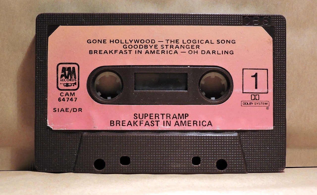
A waitress dressed as the Statue of Liberty holds orange juice aloft, viewed through a plane window onto a skyline of cereal boxes and utensils. Props mimic Manhattan’s towers playfully. This satirical tableau skewers American excess with British wit.
The parody questions the dream’s reality, mirroring the album’s eclectic pop. Conspiracy theories arose from mirrored Twin Towers hints. Breakfast’s cover captured late-70s escapism, its clever construction boosting sales and design acclaim.[1]
Album Covers as Timeless Visual Narratives
These sleeves prove imagery can deepen music’s impact, embedding stories that unfold with scrutiny. From prisms splitting light to peelable fruit, they invite endless interpretation.
Long after vinyl fades, their artistry persists in digital thumbnails and gallery walls. Album covers remind us how visuals whisper what songs shout, crafting legacies one hidden layer at a time.

CEO-Co-Founder
