


- Short Novels: The Forgotten Figures Behind Big Movements - July 23, 2026
- Short Novels: The 20 Handwritten Notes That Changed Cultural History - July 23, 2026
- Short Novels: 20 Songs That Felt Like They Were Written About Your Life - July 23, 2026
There’s something almost primal about picking up a book for the first time. Before you read a single word, a cover has already done its job. It has whispered a mood, suggested a world, and made a promise. Honestly, I think we underestimate just how much visual language shapes the way we experience literature, even before the first chapter begins.
The book cover, once a simple protective layer for pages within, has evolved into an art form that influences readers’ choices and defines an era’s cultural aesthetics. The art of creating a successful cover lies in appealing to a target audience in order to sell copies – a delicate balance between being familiar with cultural and commercial trends and having the artistic vision to craft something distinctive enough to stand out.
From jazz-soaked New York to Middle-earth’s misty mountains, certain book covers stopped time. They became more than packaging. They became myth. Let’s dive into the covers that didn’t just sell books – they changed how we see them.
The Great Gatsby by F. Scott Fitzgerald (1925) – Eyes Over a City of Dreams
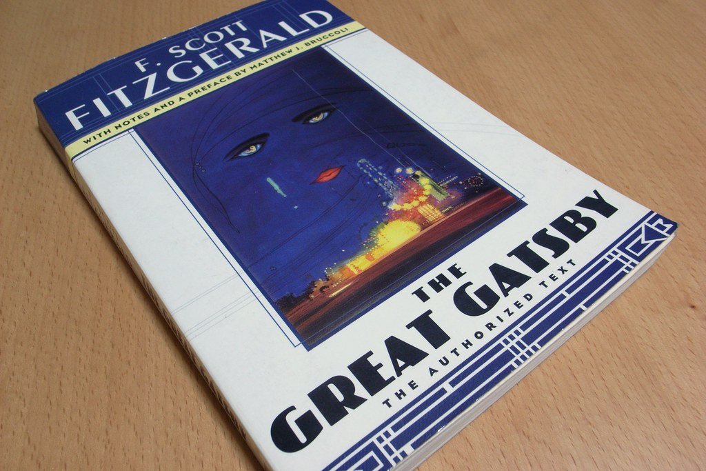
Francis Cugat’s luminous cover for F. Scott Fitzgerald’s “The Great Gatsby” perfectly embodies the decadence of the Jazz Age described in the novel. The iconic cover features colossal, sad eyes and glowing celestial visuals superimposed on a midnight blue backdrop, reflecting the themes of wealth, love, and despair central to the novel. What makes this even more remarkable is the backstory. This may be the most recognizable book cover in American literature, but it also has an unusual history. It was the only cover that Spanish artist Cugat ever designed, and he completed the work before the manuscript was finished – and it appears the cover actually influenced the book itself.
The city lights and the mysterious sad eyes in the 1925 book cover design are the chief features, and these two elements made this a legendary design in the history of American literary books. The font used makes the cover even more meaningful. Think about that for a second: a cover that wasn’t just inspired by the novel but helped shape it. That kind of creative feedback loop is almost unheard of. It’s like the painting existed before the artist knew what he was painting.
Invisible Man by Ralph Ellison (1952) – Cubism Meets the Harlem Renaissance
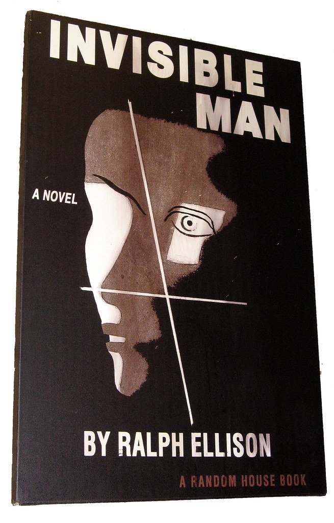
Few covers in American literature carry the intellectual weight of Edward McKnight Kauffer’s design for Ralph Ellison’s “Invisible Man.” Kauffer did a great job creating this classic book cover art, and even after it has been redesigned countless times, this first edition is still the one everybody remembers. The design has a distinct cubist influence, and it also evokes the Harlem and Jazz age, with a handful of colors and a powerful message.
The artist, Edward McKnight Kauffer, was well-known for his avant-garde design and work creating posters – something like 140 of them – for the London Underground. That poster-making background gave the cover an almost public-art quality, bold and immediate, the kind of image you absorb from across a room. It’s a deeply appropriate visual for a novel about a man struggling to be seen by a society determined to look through him.
Psycho by Robert Bloch (1959) – When Typography Becomes Terror

Like so many famous book covers, Tony Palladino’s cover for “Psycho” is simple but powerful. Featuring nothing but a giant and broken typeface in black and white, the cover immediately gives you the chills. The genius of the design lies in its restraint. There is no blood. No screaming figure. No menacing shadow. Just letters, slashed and fractured, like something has gone terribly wrong inside the very alphabet.
To create the cover, the designer used a remarkably simple gesture – all he had to do was tear up the type, and the rest is history. Like “The Godfather,” Tony Palladino’s cover art for “Psycho” made it to the promotional material for the big-screen adaptation. However, the enormous, sideways, slashed-through title would have held up on its own, Hitchcock or no Hitchcock. That’s the mark of a truly great design – it exists independently, outside the work it represents.
In Cold Blood by Truman Capote (1966) – The Color of Quiet Dread

S. Neil Fujita’s cover for Truman Capote’s “In Cold Blood” is one of those designs that makes you feel cold without quite knowing why. When Fujita first presented this cover to Capote, it was much the same as the final version – except for the coloring. The hatpin, with its tip described as resembling “a swollen drop of blood,” was originally red. Capote objected, arguing that the crime wasn’t fresh enough for red blood. In response, Fujita changed the color to burgundy and added a funereal black border to the jacket.
That negotiation between designer and author produced something extraordinary. The result is a cover that communicates dread through color temperature alone, the kind of muted, bruised palette that sits in the back of your mind long after you’ve closed the book. It shows how deeply a great cover can be tied to an author’s own emotional truth.
The Godfather by Mario Puzo (1969) – Power in a Single Hand

Simple, yet bold and significant, the cover for “The Godfather” features a heavy typeface and a puppeteer’s hand, becoming iconic imagery for the legendary novel. The design was done by the inimitable S. Neil Fujita, and his heavy, gothic typeface and puppeteer’s hand were carried over to the imagery for the film, so the look may be one of the most universally iconic on this list.
There’s something quietly brilliant about using a single hand as the central image. It doesn’t show violence. It doesn’t show men in suits or shadowy back rooms. It shows control, invisible and absolute. The cover design by Fujita, with illustration by John Kashiwabara, is so iconic that you can buy any number of T-shirts that spoof its design. When parody becomes a cultural genre in its own right, you know you’ve created something truly unforgettable.
Pride and Prejudice by Jane Austen (1894) – A Golden Peacock and a Publishing First

An 1894 edition of Jane Austen’s “Pride and Prejudice,” with a jacket design by Hugh Thomson, marked the first time the novel appeared in fully illustrated covering. The hugely popular design features a golden peacock against a navy background, and continues to be recognizable imagery for both the novel and associated book merchandise today.
There are innumerable different covers for Jane Austen’s most beloved novel, but this one – which originally covered the first fully illustrated edition published by George Allen – was not only the most popular edition at the time but continues to be the version most used for merchandise. The peacock is such an inspired choice. Proud, ornamented, slightly absurd – it’s essentially a visual metaphor for Austen’s entire social milieu. You can practically hear Mr. Darcy in the ruffled feathers.
A Clockwork Orange by Anthony Burgess (1962) – The Eye That Sees Everything

Penguin UK’s first edition of the novel introduced the iconic “cog-eyed droog” cover, which has since become a widely recognized and famous design. The designer did a clever thing by using a cog as an eye, which cleverly connects to both clockwork and the main character Alex. It went on to become one of the best book covers of all time.
It is this 1972 iteration of Burgess’s classic novel, designed by David Pelham, that has truly become iconic. The mechanical eye staring back at you is one of those images that somehow works on multiple levels at once: surveillance, conditioning, the fusion of human and machine. It’s a cover that’s doing real philosophical work, not just decoration. Honestly, it could hang in a gallery and no one would question it.
The Handmaid’s Tale by Margaret Atwood – Red as a Warning Signal

Margaret Atwood’s “The Handmaid’s Tale” boasts a haunting cover design that aligns perfectly with the dystopian narrative. The cover’s use of negative space and bold choice of colors, like the iconic red robe, evoke a sense of oppression and urgency. The simplistic yet powerful imagery of a woman’s silhouette against a red backdrop encapsulates the book’s core themes.
Few covers have transcended their books the way this one has. The red cloak became a protest symbol, worn by real women at real political demonstrations around the world. The best book covers of all time transcend mere marketing tools to become cultural artifacts that define entire generations, combining artistic brilliance with commercial appeal to create visual masterpieces that remain recognizable decades after publication. The Handmaid’s Tale cover is the purest example of exactly that.
To Kill a Mockingbird by Harper Lee (1960) – The Quiet Power of a Tree
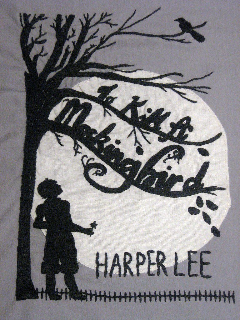
The most recognizable book cover in literary history belongs to Harper Lee’s “To Kill a Mockingbird,” with its distinctive tree silhouette that has remained virtually unchanged since 1960. This iconic cover demonstrates how simplicity can create lasting impact, influencing countless designs across the publishing industry. The cover’s enduring appeal lies in its perfect marriage of symbolism and visual restraint, making it instantly identifiable to readers worldwide.
Designed by Shirley Smith, some have criticized this cover as being too simple. However, that hasn’t stopped it from gracing the dorm room walls of book nerds everywhere. A lone tree. A child’s perspective implied. No text-heavy drama, no graphic scene-setting. Just a silhouette that somehow contains everything: innocence, justice, loss, and the long shadow of the American South.
The Hobbit by J.R.R. Tolkien (1937) – When the Author Holds the Brush
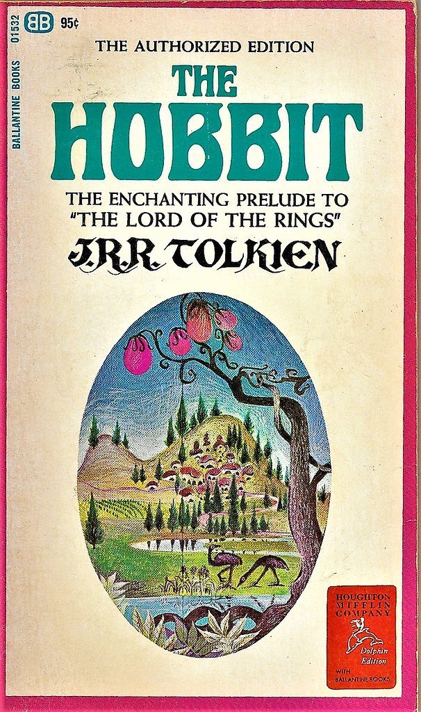
The Hobbit is a fascinating fantasy book that inspired many generations, and there are more than one beautiful cover designs out there. But the first edition design is special since it uses the design created by Tolkien himself for its first publishing in 1937. That alone makes it unlike almost anything else in literary history.
The author himself designed this cover that went on to be the most loved and one of the best book covers of all time. Although the original cover didn’t have the red sun, Tolkien wanted it to be red but had to change it due to budget restraints. Even in the constraints of budget printing, Tolkien’s visual instincts produced something magical: a world that felt ancient and imagined all at once, rendered in a style that was both childlike and deeply serious. It’s the cover equivalent of the book itself.
Jurassic Park by Michael Crichton (1990) – Bones That Speak Louder Than Words
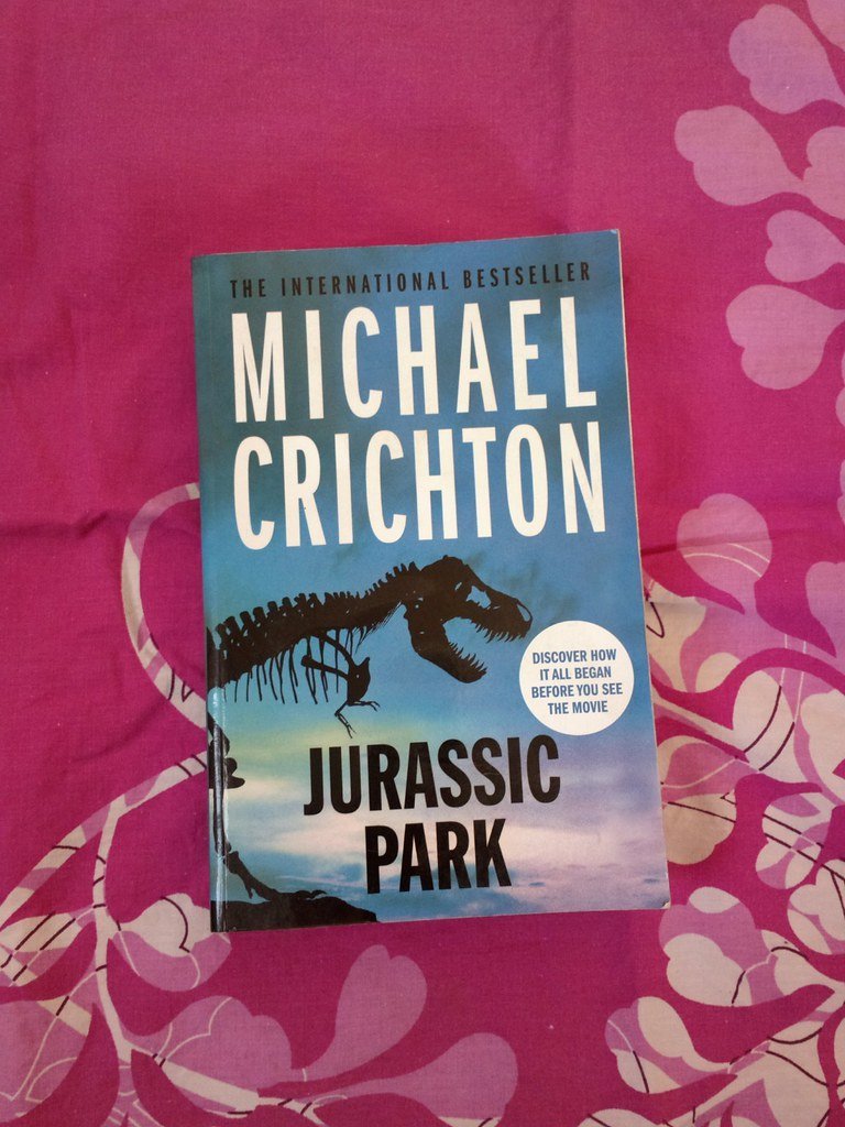
The first edition book cover of “Jurassic Park” is so simple, yet it is one of the most beautiful and famous book covers out there. It became the symbol and logo of the whole Jurassic Park universe, including the movies and the park. It’s made by Chip Kidd, one of the greatest book cover designers of all time, and it made history. Capturing the book’s atmosphere and metaphorically bringing dinosaurs back to life using nothing but bones makes sense – since that’s the only way we have contact with these amazing creatures.
What Chip Kidd understood instinctively was that absence is more terrifying than presence. A skeleton suggests something that was alive, something that could come back. This book started the revival of hand-lettering and book cover typography, all the while setting up a new book cover design trend. The cover is in deliberate contrast with the clean graphics that were popular during that time. It looked like a fossil in a world of sleek modernity. That tension was entirely the point.
Brave New World by Aldous Huxley (1932) – Earth from Above, Chillingly Beautiful
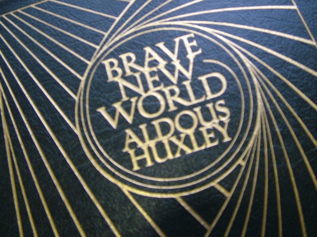
There are several categories of Brave New World covers: pill covers, machine part covers, clone covers, and earth covers – many of which visually reference the original by Leslie Holland, which is still the most celebrated and iconic, despite the fact that Holland had famously never even read the book.
That detail is almost too good. The most celebrated cover for one of literature’s most cerebral dystopias was created by a designer who hadn’t touched the manuscript. There’s something about this earth-from-above cover, designed by Leslie Holland, that makes readers more nervous than almost any other. Seen from that distance, civilization looks both beautiful and terrifyingly fragile – which, of course, is exactly Huxley’s point, rendered without a single word.
Fahrenheit 451 by Ray Bradbury – Fire That Means Something

Ray Bradbury’s “Fahrenheit 451” exemplifies how beautiful book covers can enhance a novel’s thematic impact through visual metaphor. The cover’s flame imagery and typography create an immediate connection to the book’s central themes of censorship and knowledge destruction. This design approach has influenced how publishers approach covers for socially conscious literature, demonstrating that beauty and meaning can coexist effectively.
The flame on the cover isn’t decorative. It’s a moral argument. Fire destroys books in the story, yet it also illuminates. There’s a contradiction built right into the visual, and that ambiguity is exactly what makes it so powerful. A great cover doesn’t explain the book. It raises the same questions the book will spend hundreds of pages trying to answer.
A Streetcar Named Desire by Tennessee Williams (1947) – Lithograph as Literature

The lithograph of Alvin Lustig’s cover for Williams’ play, which was published in hardcover by New Directions in 1947, is part of the permanent collection at the Cooper Hewitt museum. That’s an extraordinary designation. Not “a fine cover” or “a collector’s item” – a piece of art preserved in a museum of design.
Lustig brought a kind of expressionist fever to the image, forms bleeding into each other, color used emotionally rather than literally. It’s a cover that feels like the play itself feels: nervous, hot, on the verge of something breaking. The cover’s artistic merit extends beyond commercial appeal, earning recognition in design circles and museums. This elevation of book cover design to fine art status represents a significant development in publishing, where beautiful book covers are increasingly viewed as standalone artistic achievements.
The Catcher in the Rye by J.D. Salinger (1951) – Designed by a Friend, Approved by a Recluse
Salinger was notoriously strict about the way his books were presented – “The Catcher in the Rye” is the only one with any kind of image at all. His close friend E. Michael Mitchell was his neighbor in Connecticut while he was writing his most famous work; reportedly, Salinger read bits of the book out loud to his friend as he was working on it.
Holden Caulfield’s angsty journey is encapsulated on its cover with a blend of simplicity and depth. The cover’s minimalistic design with a solitary figure captures the essence of the protagonist’s isolated worldview. The red accent symbolizes Holden’s inner turmoil, creating a visually striking contrast. The cover is almost confrontationally restrained for a book that became a cultural earthquake. Which, come to think of it, makes it perfect.
The Lord of the Rings by J.R.R. Tolkien – Landscapes That Feel Like Memory
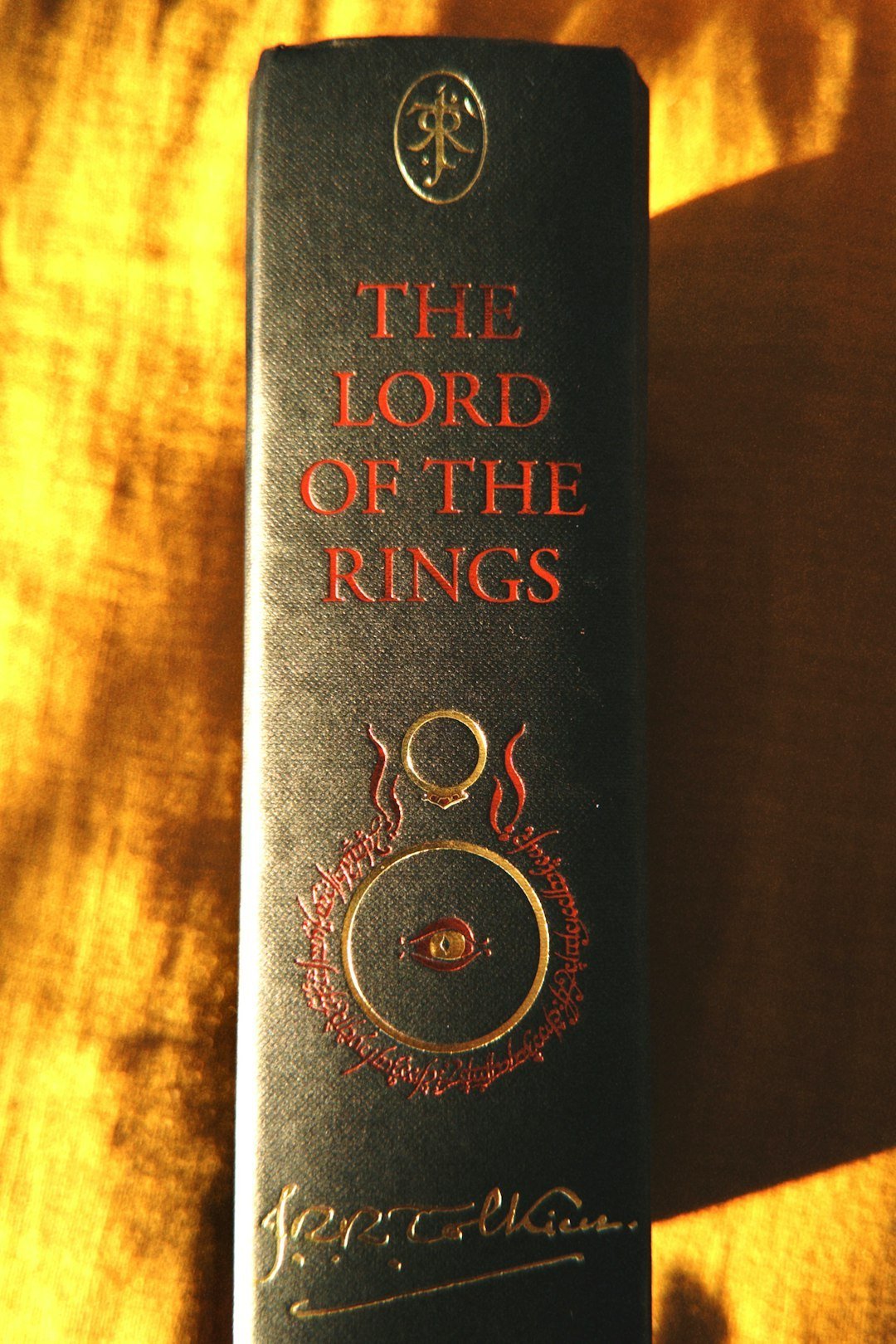
J.R.R. Tolkien’s epic fantasy saga “The Lord of the Rings” boasts some of the most iconic and recognizable book covers in literary history. The cover designs beautifully capture the essence of the magical world of Middle-earth, with intricate illustrations and typography that transport readers into a realm of adventure and heroism. The use of vivid colors, intricate details, and symbolic imagery on the covers perfectly encapsulates the grand scope and enduring appeal of this beloved fantasy masterpiece.
Tolkien’s “The Lord of the Rings” trilogy covers have evolved over time, but the most recognizable versions feature Middle-earth landscapes that transport readers before they open the first page. This is cover design at its most ambitious – not hinting at a story but attempting to render an entire world. The best editions make you feel like you’ve already been somewhere you’ve never been. That’s not a small achievement.
Conclusion: When a Cover Becomes a Cultural Object

The most iconic book covers exist as cultural artifacts that are attached to, but slightly separate from, the books they were designed for. That’s the strange and beautiful paradox at the heart of great cover art. It serves the book, and yet somehow escapes it – becoming something people tattoo on their skin, print on tote bags, and hang on walls.
Some designers not only match all of the criteria of clarity, memorability, and meaning, but they also create such iconic imagery that we cannot forget about it for decades after, finally assimilating the design with the book itself. That process of assimilation is what turns a commercial product into a piece of cultural history.
I think the greatest covers share one thing: they feel inevitable. As if the book could never have looked any other way. That sense of inevitability is actually the hardest thing in design to achieve, and the designers behind these covers pulled it off in ways that still astonish us today. The next time you reach for a book, pause for a moment before you open it. Someone spent weeks, maybe months, trying to make you feel exactly what you’re feeling right now.
What would your personal all-time favorite cover be? Tell us in the comments.

Besides founding Festivaltopia, Luca is the co founder of trib, an art and fashion collectiv you find on several regional events and online. Also he is part of the management board at HORiZONTE, a group travel provider in Germany.
