

For any feedback please reach out to info@festivalinside.com
- 12 Unexpected Ways Classic Literature Influenced Modern Pop Culture - April 6, 2026
- 15 Literary Hoaxes So Clever, They Fooled the Entire Publishing World - April 6, 2026
- 12 Masterpieces of Architecture That Were Nearly Lost to History - April 6, 2026
Ever glanced at a world map and wondered why Greenland seems to swallow up entire continents? That hulking ice-covered landmass rivals Africa’s footprint, fooling eyes worldwide into thinking they’re equals. Here’s the thing: it’s all down to a 16th-century trick of the trade that prioritizes sailors over truth.
This distortion isn’t just a quirky map quirk. It shapes how we view everything from climate crises to global power plays. Let’s unpack the reality behind the ruse, starting with the culprit itself.
Origins of the Mercator Projection
Gerardus Mercator, a Belgian cartographer, dropped his game-changing projection in 1569 during the height of exploration fever. He crafted it for mariners, turning curved sea routes into straight lines on paper so ships could hold steady compass bearings. That rhumb line magic revolutionized navigation across vast oceans.
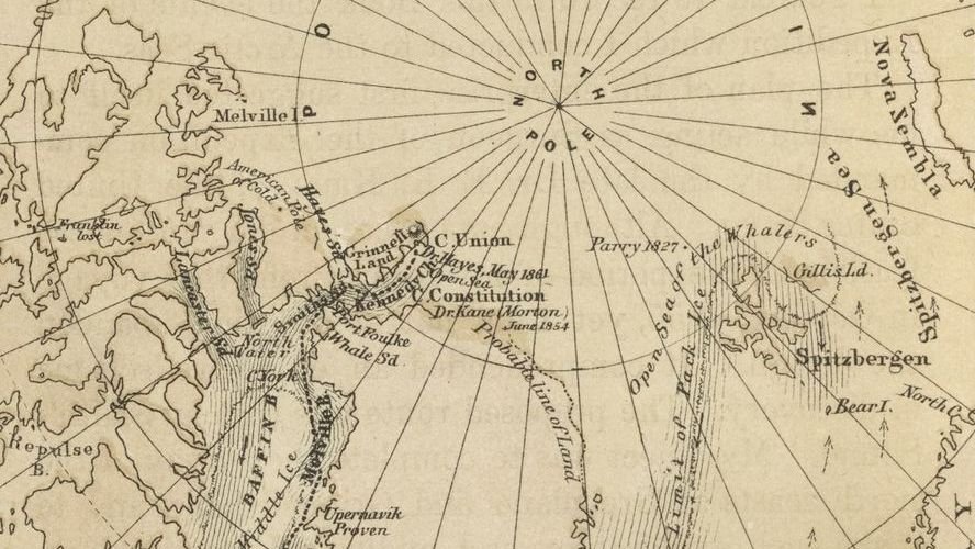
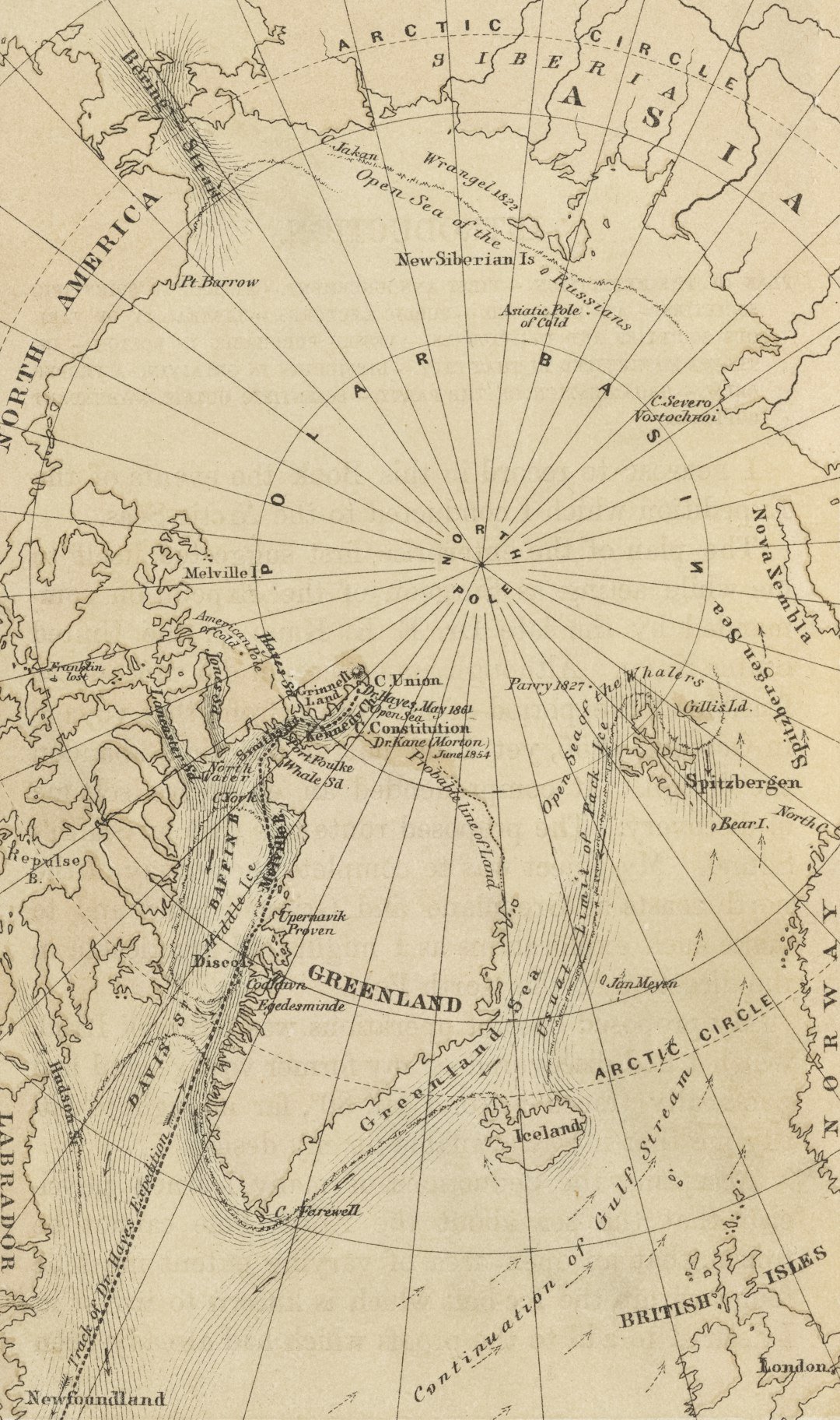
Mathematically, it stretches latitudes as they climb north, exploding sizes near the poles. Greenland, parked high in the Arctic at 70 to 80 degrees north, balloons to about ten times its real 2.16 million square kilometers. Equatorial spots like Brazil dodge the worst, keeping proportions close to true.
This built-in bias favors temperate zones, quietly embedding a northern slant into our worldview. No wonder it stuck around in classrooms and apps for centuries.
Greenland Versus Africa: A Reality Check
Africa clocks in at 30.37 million square kilometers, big enough to gulp down the United States, China, India, and chunks of Europe. Greenland? It covers just 7 percent of that, smaller than Mexico by far. Yet Mercator maps plaster them side by side like twins.
This sleight of hand downplays Africa’s teeming 1.4 billion people and wild biodiversity. Climate experts point out it amps up Arctic ice stories while shrinking tropical threats like deforestation. Casual map-glancers buy the illusion hook, line, and sinker.
True comparisons cry out for equal-area maps like Gall-Peters or Robinson. Drag Greenland over Africa on tools like TheTrueSize.com, and it shrinks to a mere speck.
How Map Projections Warp Our World
No flat map nails a round Earth perfectly; they all juggle shape, area, distance, or direction. Mercator nails shape and direction but trashes area past 60 degrees latitude. Picture unrolling a globe like a cylinder – the poles stretch wildly.
Greenland’s ice cap morphs into a continent-sized blob up there. Its grip on schools, Google Maps, and media cements the error in our brains. Azimuthal equidistant projections, like those on UN flags, trade shape for honest sizes.
Here’s the kicker: this isn’t ancient history. Web Mercator powers your daily zooms, keeping the myth alive in the digital age.
Historical Ripples and Modern Hangovers
Mercator’s chart turbocharged European voyages to the New World with spot-on transatlantic paths. Subtly, it puffed up northern lands and squeezed southern ones, feeding Eurocentric views. Colonial eyes saw Africa as tidy and tame, missing its vast might.
Explorers like David Livingstone swore by it back in the 1800s. GPS sidelined it for navigation, but web standards resurrect it online. Decolonizing cartography now pushes Global South-centered views.
Politicians still trip over it in Arctic versus Africa debates. Viral drags of Greenland over Africa rack up millions of views, chipping at the status quo.
Alternatives Gaining Traction
Arno Peters launched his equal-area projection in 1973, making Africa a giant and Greenland a pipsqueak. Shapes stretch weirdly, but it fights the bias head-on. National Geographic ran with Robinson for balance until newer options.
Boston schools now mandate equal-area maps for kids. Open-source tools let you pick distortions on the fly. Indigenous mappers from Inuit to Aboriginal lands center real lives over poles.
Winkel Tripel offers a sweet spot of size and shape. AI could soon whip up adaptive maps tailored just for you.
Final Thought
Mercator’s legacy lingers, twisting climate talks and geopolitics from Arctic grabs to African droughts. True maps could realign priorities, spotlighting real scales. What’s your go-to map app guilty of this? Drop your thoughts in the comments.
Source: Original YouTube Video

Christian Wiedeck, all the way from Germany, loves music festivals, especially in the USA. His articles bring the excitement of these events to readers worldwide.
For any feedback please reach out to info@festivalinside.com
