

- The Strange Lives of 15 Famous Novelists - June 11, 2026
- 20 Books You Didn’t Know Were Based on Real People - June 11, 2026
- It Started in Hawaii – And It Shaped How America Sees the Pacific, War, and Paradise - June 11, 2026

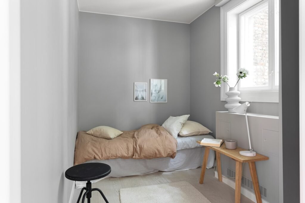
A Shift Toward Grounded Serenity (Image Credits: Unsplash)
Homeowners seeking tranquility in their living spaces found inspiration in the latest 2026 paint color forecasts, which emphasized soothing, earth-derived shades.
A Shift Toward Grounded Serenity
Design experts observed a clear move away from bold statements toward colors that evoke stability and calm. Warm neutrals dominated early predictions, offering a subtle foundation for any room. These tones, drawn from natural landscapes, promised to reduce visual clutter and foster relaxation. Industry leaders like Sherwin-Williams unveiled collections such as Honest Essentials, featuring muted beiges and soft taupes that blended seamlessly with everyday decor.
This trend reflected broader desires for biophilic design, where interiors mirrored the outdoors. Professionals noted that such palettes helped counter the fast pace of modern life. For instance, earthy ochres emerged as favorites for their warm, sun-baked feel. Overall, the focus remained on hues that nurtured well-being without overwhelming the senses.
Embracing Subtle Greens and Blues
Nature-inspired greens took center stage in 2026 forecasts, with muddy and olive variations leading the way. Designers highlighted shades like Benjamin Moore’s Green Grove, a dusty deep green that created elegant, balanced atmospheres. These colors connected occupants to the environment, promoting a sense of renewal. Smoky jades also gained traction, adding depth without intensity.
Blues followed closely, in softer, sky-like iterations that evoked openness. Experts predicted their use in bedrooms and offices to enhance focus and rest. This combination of greens and blues formed a versatile duo for creating cohesive, calming zones. Homeowners experimented with these in powder rooms and living areas, where they paired well with natural textures like wood and linen.
Pantone’s Bold White and Mixed Reactions
Pantone announced Cloud Dancer as its 2026 Color of the Year, marking the first white selection in the program’s history. This soft, clean shade aimed to symbolize a fresh start and simplicity in design. Reactions varied, with some praising its versatility for brightening spaces, while others questioned its impact amid bolder trends. Still, it integrated easily into neutral schemes, serving as a crisp backdrop for accents.
The choice sparked discussions on minimalism’s role in serene homes. Designers suggested layering it with warmer undertones to avoid sterility. In practice, Cloud Dancer appeared in kitchens and hallways, where it amplified light and expanded perceived space. This unexpected pick underscored the year’s emphasis on understated elegance.
Incorporating Trends with Timeless Appeal
To apply these colors effectively, professionals recommended starting with small areas like accent walls or furniture. Color drenching, where a single hue covered walls, trim, and textiles, emerged as a popular technique for immersive calm. Warm neutrals worked best in high-traffic zones, while greens suited quieter retreats. Testing samples under different lighting ensured the desired mood.
Avoiding fleeting fads, experts advised blending trends with personal style. For example, pairing olive green with soft yellows like Timeless Sun created inviting nooks. This approach extended to textured finishes, adding dimension without complexity. Homeowners thus achieved enduring spaces that evolved over time.
- Warm neutrals like Quartz Sand for versatile bases.
- Muddy greens such as Verde Mantra for natural depth.
- Soft whites including Cloud Dancer for airy freshness.
- Smoky jades and ochres to ground living areas.
- Subtle blues for restorative bedrooms.
Key Takeaways
- 2026 trends prioritize earth tones for emotional balance.
- Pantone’s white offers simplicity amid colorful options.
- Integrate hues gradually to maintain timeless decor.
As 2026 unfolds, these paint trends invite a return to thoughtful, restorative design that honors both nature and personal sanctuary. Consider how a single color shift might transform your home – what shade calls to you most? Share your thoughts in the comments.

Besides founding Festivaltopia, Luca is the co founder of trib, an art and fashion collectiv you find on several regional events and online. Also he is part of the management board at HORiZONTE, a group travel provider in Germany.
