


For any feedback please reach out to info@festivalinside.com
- 25 Underrated U.S. Cities You Should Visit Before They Get Too Popular - July 12, 2026
- Hidden Messages in Famous Logos - July 12, 2026
- 12 Famous Paintings with Hidden Faces – Can You Find Them? - July 12, 2026
Have you ever looked at a famous logo and felt like there was something more, something just beneath the surface? It’s almost magical how some brands hide clever secrets in plain sight, waiting for those “aha!” moments. These hidden messages aren’t just for fun—they’re powerful tools that shape our feelings and memories about the brands we see every day. Let’s embark on a surprising journey through ten well-known logos and discover the mysteries they hold. You may never look at your favorite brands the same way again!
FedEx: The Arrow of Speed

The FedEx logo is a masterpiece of subtlety, hiding a secret that most people don’t notice at first glance. Nestled between the “E” and the “x,” there’s a perfectly formed arrow created by negative space. This isn’t just a quirky graphic trick—this arrow is a symbol of speed, precision, and forward motion. It captures the very essence of FedEx’s promise: delivering packages quickly and efficiently. When you spot the arrow, there’s a little jolt of surprise, and suddenly the logo feels smarter. It’s a simple reminder that sometimes the most important things are hidden in plain sight, just waiting to be discovered.
Amazon: From A to Z with a Smile

Amazon’s logo is more than just letters and a swoosh. There’s an arrow that stretches from the “A” to the “Z,” and that’s not by accident. The arrow tells us that Amazon has everything—from A to Z—making it a one-stop shop for nearly anything you can imagine. But it does even more: the arrow forms a smile, hinting at the happiness Amazon wants its customers to feel. This dual meaning is clever and heartfelt, making the logo both playful and reassuring. Every time you see the smile, you’re reminded of the promise that Amazon is here to make life easier and more cheerful.
Baskin-Robbins: 31 Flavors Hidden in Letters
Baskin-Robbins is famous for offering 31 ice cream flavors, and their logo hides this number in a playful way. If you look closely at the pink parts of the “B” and “R,” you’ll see the number “31” cleverly tucked inside. It’s a sweet secret that ties back to their original idea: a different flavor for every day of the month. This little detail is more than just a design flourish—it’s a celebration of variety and fun, inviting customers to pick something new every visit. The hidden “31” makes the logo irresistible, especially when you realize it’s always been there, like a delicious riddle.
Toblerone: The Bear in the Mountain
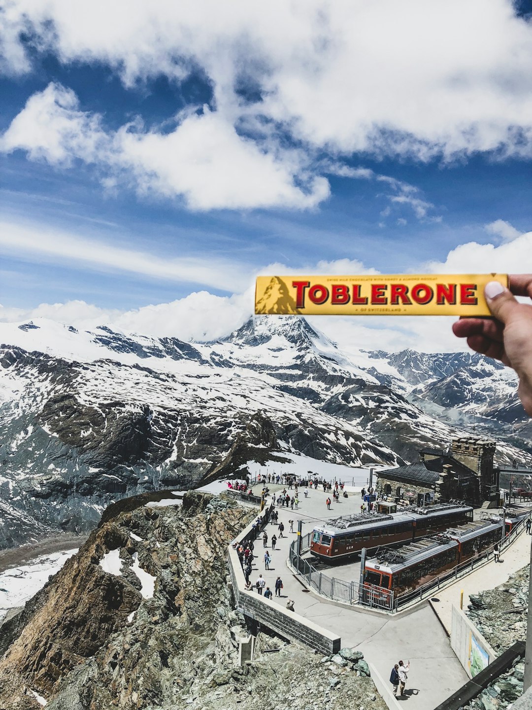
Toblerone’s logo is a tribute to its roots, but you have to look closely to see why. The mountain graphic isn’t just about the Swiss Alps; hidden in its peaks is the silhouette of a bear. This is a nod to Bern, Switzerland—called the “City of Bears”—where Toblerone was created. The hidden bear is a symbol of strength, tradition, and pride in their home city. For those who spot it, the logo becomes a little more special. It turns every bar of chocolate into a quiet celebration of heritage and quality.
Tostitos: Sharing Chips and Salsa

The Tostitos logo might seem like just a fun typeface, but it’s packed with meaning. Look at the two “T”s in the middle—they’re actually people, and they’re reaching for the same chip. The dot over the “i”? That’s a bowl of salsa. This clever design turns the logo into a tiny party, full of laughter and sharing. It perfectly matches the brand’s spirit: snacks are best enjoyed together. Every time you see the logo, you’re reminded that Tostitos is about fun, friends, and good times around the table.
Toyota: Every Letter in the Emblem

Toyota’s logo is a puzzle that’s surprisingly satisfying to solve. Made up of overlapping ovals, it looks simple at first. But if you look closely, you’ll find that each letter of the word “Toyota” is hidden inside the shapes. This isn’t just an exercise in clever design—it’s a subtle way of weaving the brand’s identity right into its symbol. The ovals also evoke feelings of unity, trust, and reliability, qualities that Toyota wants every driver to experience. The logo’s hidden letters turn it into a badge of honor for anyone who loves solving a good mystery.
Coca-Cola: The Danish Welcome
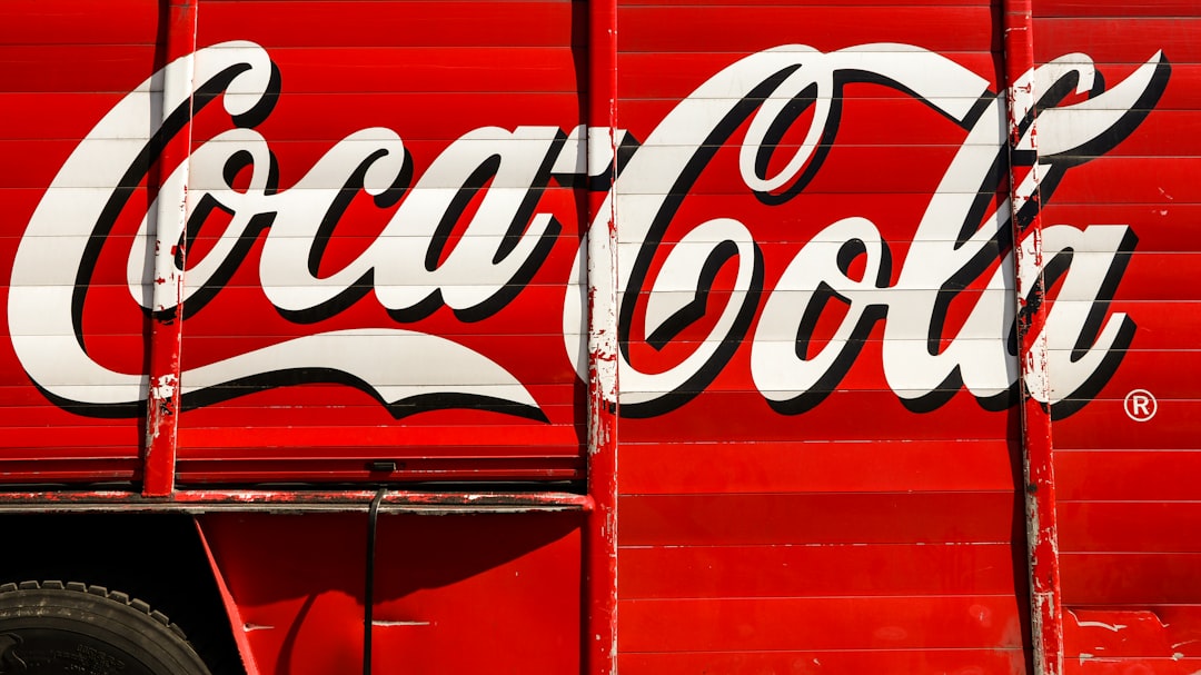
Coca-Cola’s logo is iconic around the world, but in Denmark, there’s an extra layer of meaning. If you focus on the way the “o” and “l” are styled, you’ll see a resemblance to the Danish flag. This wasn’t random—it was used in a campaign to greet travelers at Danish airports, making them feel instantly welcome. The hidden flag is a symbol of hospitality and connection, showing how Coca-Cola can adapt its classic logo to fit different cultures. For Danish consumers, it’s a small but powerful gesture that turns a global brand into something local and personal.
Pepsi: The Secret Science of the Logo
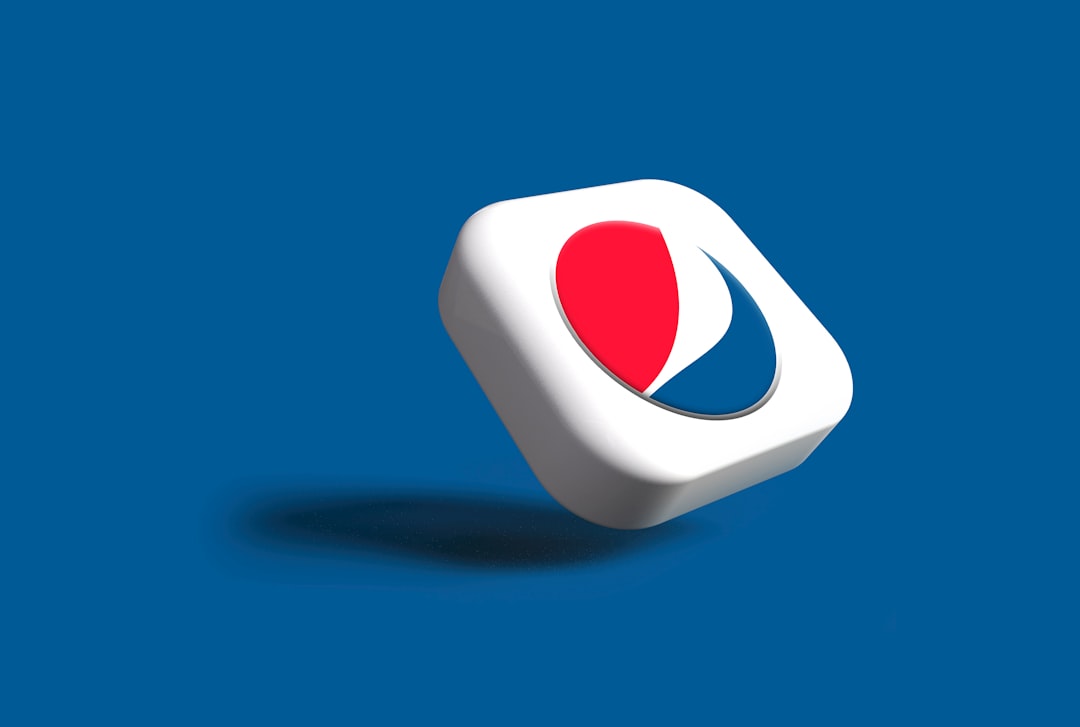
The Pepsi logo has sparked curiosity and debate, with some claiming it’s full of hidden meanings. After a redesign in 2008, documents revealed that the new logo was inspired by concepts like the golden ratio, Feng Shui, and even the Earth’s magnetic field. While these connections might seem mysterious or even far-fetched, the goal was to create a logo that feels balanced, energetic, and modern. Whether you believe in the science or not, the logo’s curves and colors are designed to grab your attention and make you feel energized—just like taking a sip of an ice-cold Pepsi.
NBC: The Peacock and Its Feathers
NBC’s logo is instantly recognizable, but there’s a story hidden in its white space. The shape in the center is actually a peacock, looking to the right—toward the future. Its six colored feathers represent the network’s divisions and its vibrant programming. The peacock is a symbol of beauty and diversity, a reminder that NBC aims to bring colorful, engaging content to its viewers. Whenever you see the logo, you’re seeing more than just a bird—you’re seeing a promise of innovation and an endless spectrum of stories.
Sony VAIO: Bridging Analog and Digital
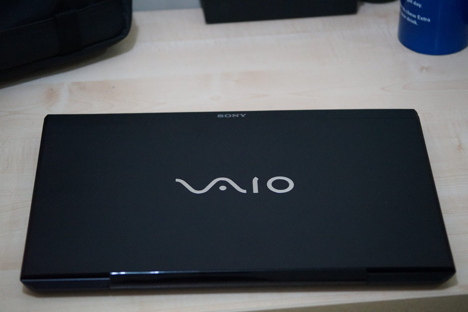
Sony VAIO’s logo is a clever blend of old and new. The “VA” forms a wave, representing analog technology, while the “IO” stands for the binary digits 1 and 0, the language of digital electronics. This fusion isn’t just a visual trick—it’s a statement about the brand’s mission to connect the past and future of technology. The logo appeals to anyone who has ever wondered how technology is evolving, making it both a symbol and a conversation starter. It’s proof that even a simple logo can tell a complex and inspiring story.

Christian Wiedeck, all the way from Germany, loves music festivals, especially in the USA. His articles bring the excitement of these events to readers worldwide.
For any feedback please reach out to info@festivalinside.com
