


For any feedback please reach out to info@festivalinside.com
The Beatles – Sgt. Pepper’s Lonely Hearts Club Band (1967)

The cover of “Sgt. Pepper’s Lonely Hearts Club Band” is more than a vibrant collage—it’s a cryptic puzzle that has fueled speculation for decades. Over 70 figures crowd the scene, from Bob Dylan to Marilyn Monroe, each one carefully chosen to reflect the band’s influences. But it’s the arrangement that has sparked the most debate. Many believe it resembles a funeral, with Paul McCartney’s placement and attire suggesting he’s the guest of honor—dead, according to the infamous “Paul is dead” conspiracy. The hand above Paul’s head, a supposed symbol of death, and the patch on his sleeve reading “OPD” (allegedly “Officially Pronounced Dead”) only add to the intrigue. Fans still spend hours analyzing every object and floral display for hidden clues. The album’s visual complexity mirrors the psychedelic, experimental nature of the music itself, making the cover a lasting symbol of 1960s cultural revolution.
Nirvana – Nevermind (1991)

The unforgettable image of a baby swimming after a dollar bill on Nirvana’s “Nevermind” cover is as provocative as it is iconic. While the photo is visually simple, its message is anything but. It’s a sharp critique of American consumerism, representing innocence corrupted by the lure of money. The baby’s naked vulnerability, contrasted with the artificial lure of the dollar, highlights the pressures placed on youth in a capitalist society. After its release, the cover sparked controversy and even lawsuits, but the band insisted the image was an honest reflection of the album’s themes of disillusionment and lost innocence. The fact that this imagery remains relevant over 30 years later speaks to its cultural impact. The cover has become a touchstone for discussions about the price of fame and the commodification of art and life.
Pink Floyd – The Dark Side of the Moon (1973)

At first glance, the cover of “The Dark Side of the Moon” is elegantly simple—a prism dispersing light into a rainbow. Yet this image packs a philosophical punch, representing not just scientific phenomena, but also consciousness and enlightenment. The design aligns perfectly with the album’s exploration of madness, mortality, and the pressures of modern existence. The prism splitting white light into a spectrum can be seen as a metaphor for the human mind, fragmented yet beautiful. This artwork, created by Storm Thorgerson and Hipgnosis, became so recognizable that it’s now inseparable from Pink Floyd’s identity. The choice of minimalism, with its precise geometry and stark contrasts, was bold for its time and still inspires artists today. The album itself has sold more than 45 million copies worldwide, making this cover one of the most seen and discussed in history.
Led Zeppelin – In Through the Out Door (1979)
Led Zeppelin’s “In Through the Out Door” took album art to a new level of interactivity. The record was sold in a brown paper bag concealing one of six possible covers, each depicting a different perspective of the same bar scene. But the real surprise was hidden inside: the inner sleeve was printed in black-and-white, and when fans brushed it with water, it revealed a burst of color. This playful, almost magical element mirrored the album’s themes of change and discovery. At a time when digital technology was nowhere near today’s standards, this analog “reveal” was nothing short of innovative. Fans would often trade covers to collect the set, turning the album into a collectible experience as much as a musical one. The packaging’s cleverness made it stand out in a crowded market, reinforcing Led Zeppelin’s reputation for creativity.
The Rolling Stones – Their Satanic Majesties Request (1967)

The Rolling Stones dove headfirst into psychedelia with the 3D lenticular cover of “Their Satanic Majesties Request.” At first glance, it’s a swirl of colors and costumes, but look closer and you’ll spot the faces of The Beatles cleverly hidden among the crowd. This was more than an Easter egg—it was a cheeky nod to the so-called rivalry between the two biggest bands of the era. The Stones’ willingness to embrace the surreal and the experimental reflected their competitive spirit and their desire to push boundaries. The use of 3D technology was groundbreaking at the time, making this album cover a collector’s item. The playful inclusion of their rivals speaks to the camaraderie and competition that defined the British music scene in the 1960s. It remains a favorite for fans eager to spot every hidden detail.
Tool – 10,000 Days (2006)
Tool has a reputation for mind-bending artwork, and the cover of “10,000 Days” is a brilliant example. Instead of a traditional image, the album comes with built-in lenses that let fans view hidden stereoscopic 3D images embedded in the artwork. This interactive element isn’t just a gimmick—it draws listeners deeper into the album’s themes of vision, perception, and transformation. The artwork’s intricate, fractal-like designs echo the complex rhythms and layered sounds Tool is known for. By requiring physical engagement, the band challenges fans to look beyond the obvious, both visually and musically. The result is a multisensory experience that feels like unlocking a secret world. Tool’s commitment to this level of detail has helped cement their cult status and inspired other artists to rethink the possibilities of album packaging.
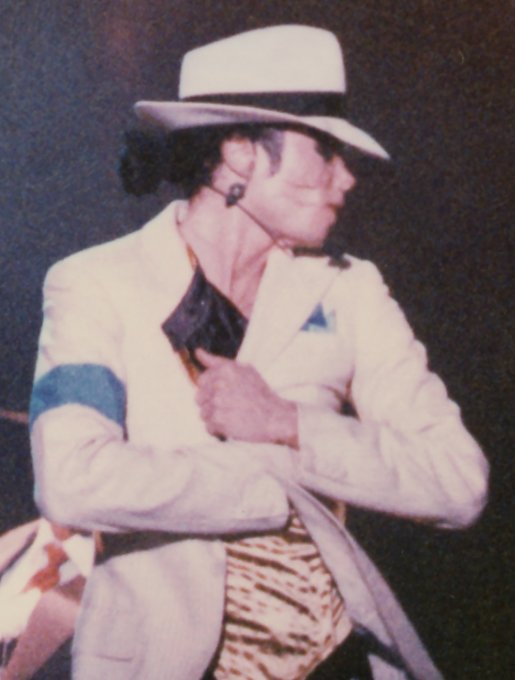
The Beatles – Abbey Road (1969)

“Abbey Road” may be the most imitated album cover of all time, but its hidden messages have fueled speculation for generations. Paul McCartney’s bare feet and out-of-step stride compared to his bandmates reignited the “Paul is dead” urban legend, with fans claiming each band member represented a figure from a funeral procession: John as the priest, Ringo as the undertaker, George as the gravedigger, and Paul as the corpse. The car parked in the background, the license plate reading “28IF,” was said to suggest Paul would have been 28 if he’d lived. Whether intended or not, these details have made the crosswalk outside Abbey Road Studios a pilgrimage site for music lovers. The image’s simplicity belies the layers of meaning fans continue to unearth, making it a touchstone of pop culture mystery.
Iron Maiden – Somewhere in Time (1986)

Iron Maiden’s “Somewhere in Time” cover is a feast for eagle-eyed fans and metal historians alike. The futuristic cityscape is packed with hidden references, from neon signs referencing earlier albums to graffiti nodding at the band’s mascot, Eddie. Artist Derek Riggs created a visual labyrinth, with time-travel motifs and subtle in-jokes rewarding those willing to hunt for them. Every detail, from the names of pubs to the numbers on buildings, can be traced back to moments in the band’s career or lyrics from their songs. The cover’s complexity reflects Iron Maiden’s love for storytelling and their connection to fans who relish solving these visual puzzles. Over the years, fans have compiled exhaustive lists of these “Easter eggs,” making the artwork as much a part of the album’s legacy as the music itself.
Radiohead – Kid A (2000)

Radiohead’s “Kid A” marked a seismic shift in both sound and vision. The cover, with its jagged mountains and distorted, glitchy typography, is a visual metaphor for the album’s themes of digital alienation and apocalypse. Artist Stanley Donwood’s approach was to make the art feel unsettling, mirroring the cold, electronic tones of the music. If you fold and view the artwork in a certain way, the mountains appear even more menacing, hinting at environmental collapse and societal breakdown. This ambiguity was intentional—Radiohead wanted to evoke a sense of unease and displacement. As the music industry moved further into the digital age, this cover became emblematic of the uncertainty and anxiety of the new millennium. Fans and critics have praised its ability to capture the spirit of the times in a single, haunting image.
Prince – Lovesexy (1988)
When “Lovesexy” arrived in stores, Prince’s choice to appear nude amid a swirl of flowers was both shocking and deeply symbolic. The image stirred controversy, with some retailers refusing to stock the album, but Prince stood firm—he intended the cover to represent spiritual rebirth and the merging of sexuality and divinity. The floral imagery softens the nudity, suggesting innocence and new beginnings rather than provocation. This bold statement challenged norms and forced conversations about the relationship between art, the body, and spirituality. Prince’s willingness to bare himself—literally and artistically—became a hallmark of his career. The cover’s layers of meaning still spark debate about identity, self-expression, and the boundaries of popular culture.
Red Hot Chili Peppers – Californication (1999)
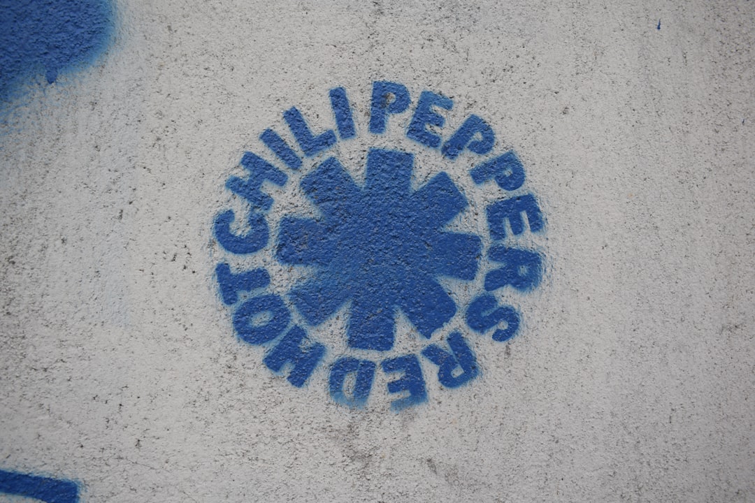
The “Californication” cover is a visual riddle: a swimming pool with the sky as water and water as the sky, flipping reality on its head. This optical illusion captures the album’s critique of Hollywood’s illusions and the disorienting pursuit of fame. The Red Hot Chili Peppers used this imagery to symbolize how the California dream can turn into a nightmare of confusion and lost identity. The reversed imagery invites the viewer to question what’s real and what’s artificial—a recurring theme in the lyrics. The cover’s surreal quality reflects the band’s willingness to confront the darker side of sunshine and celebrity. Its enduring popularity shows that fans connect with the sense of displacement and longing woven throughout the album.
David Bowie – Aladdin Sane (1973)
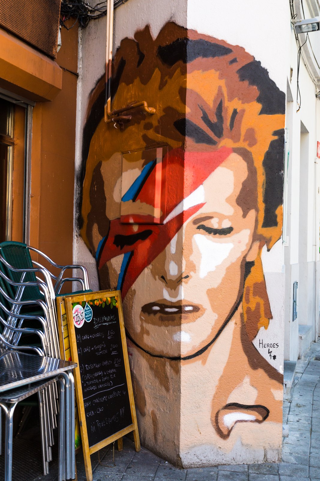
The lightning bolt slashed across David Bowie’s face on the “Aladdin Sane” cover is one of music’s most enduring images. More than a glam-rock fashion statement, it symbolizes Bowie’s fascination with duality and the fragmentation of identity. The title itself is a pun: “A Lad Insane.” Bowie described the character as “Ziggy goes to America,” suggesting a personality split by fame and excess. Photographer Brian Duffy captured Bowie’s haunted, otherworldly stare, making the cover a visual shorthand for the album’s themes of madness and transformation. Over time, the lightning bolt has become an emblem for individuality and reinvention. Bowie’s legacy as a shape-shifting icon is perfectly encapsulated in this unforgettable portrait.
Korn – Issues (1999)

Korn broke new ground with “Issues” by holding a fan art contest for the cover, resulting in four different versions, each featuring a disturbing handmade doll. The winning design, a tattered ragdoll with a button eye and stitched mouth, became a symbol of trauma and innocence lost—central themes of the album. The doll’s haunted expression and childlike form evoke fears rooted in childhood and speak to the band’s own struggles. Fans embraced the chance to participate in the album’s creation, forging a deeper connection between the music and its listeners. Korn’s willingness to explore pain and vulnerability, both visually and lyrically, set them apart in the world of nu-metal. The cover’s unsettling imagery still resonates with those who have faced their own “issues.”
Michael Jackson – Dangerous (1991)
The cover of Michael Jackson’s “Dangerous” is a dense tapestry of symbolism, painted by surrealist artist Mark Ryden. Every inch teems with hidden figures and cryptic references, from nods to Jackson’s childhood and career to broader commentary on fame and the entertainment industry. The eyes staring out from behind a mask hint at the tension between Jackson’s public persona and private self. Elephants, monkeys, and carnival motifs swirl throughout, inviting endless interpretation. Fans have spent years cataloging every symbol and speculating on their meaning. The cover’s complexity mirrors Jackson’s own enigmatic life, packed with spectacle, secrecy, and controversy. “Dangerous” stands not just as an album, but as a visual encyclopedia of one of pop’s most mysterious figures.
Tool – Lateralus (2001)
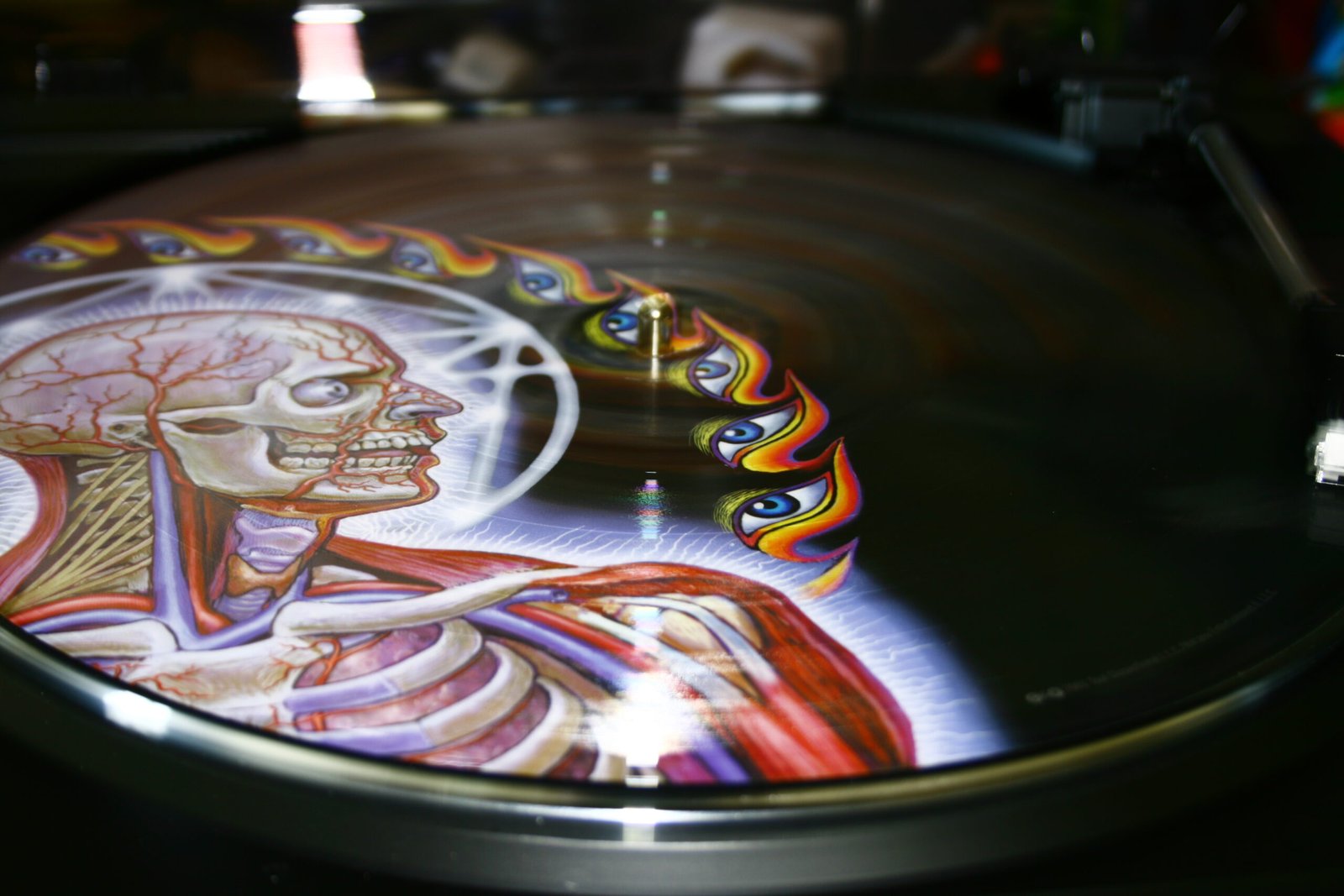
Tool’s “Lateralus” isn’t just an album—it’s an anatomical journey. The cover features transparent layers that, when stacked, reveal the intricate structures of the human body—from skin to muscle to bone. This design, created by artist Alex Grey, perfectly complements the album’s themes of evolution, spiritual awakening, and interconnectedness. The physical act of lifting the layers mirrors the album’s invitation to look beneath the surface, both in art and in life. Tool’s meticulous attention to detail draws fans into a deeper engagement with the music and its meaning. The cover stands as a testament to the band’s belief that art and science, body and mind, are inseparable. For many, it’s a reminder that true understanding comes only from seeing all the layers—inside and out.

Christian Wiedeck, all the way from Germany, loves music festivals, especially in the USA. His articles bring the excitement of these events to readers worldwide.
For any feedback please reach out to info@festivalinside.com
