
- The Mathematical Formulas Hidden in Famous Musical Compositions - October 21, 2025
- Foods Mentioned in Literature That Defined Entire Eras - October 21, 2025
- 10 Cities That Became Unexpected Capitals of Culture - October 21, 2025
The Great Gatsby (1925) – Francis Cugat
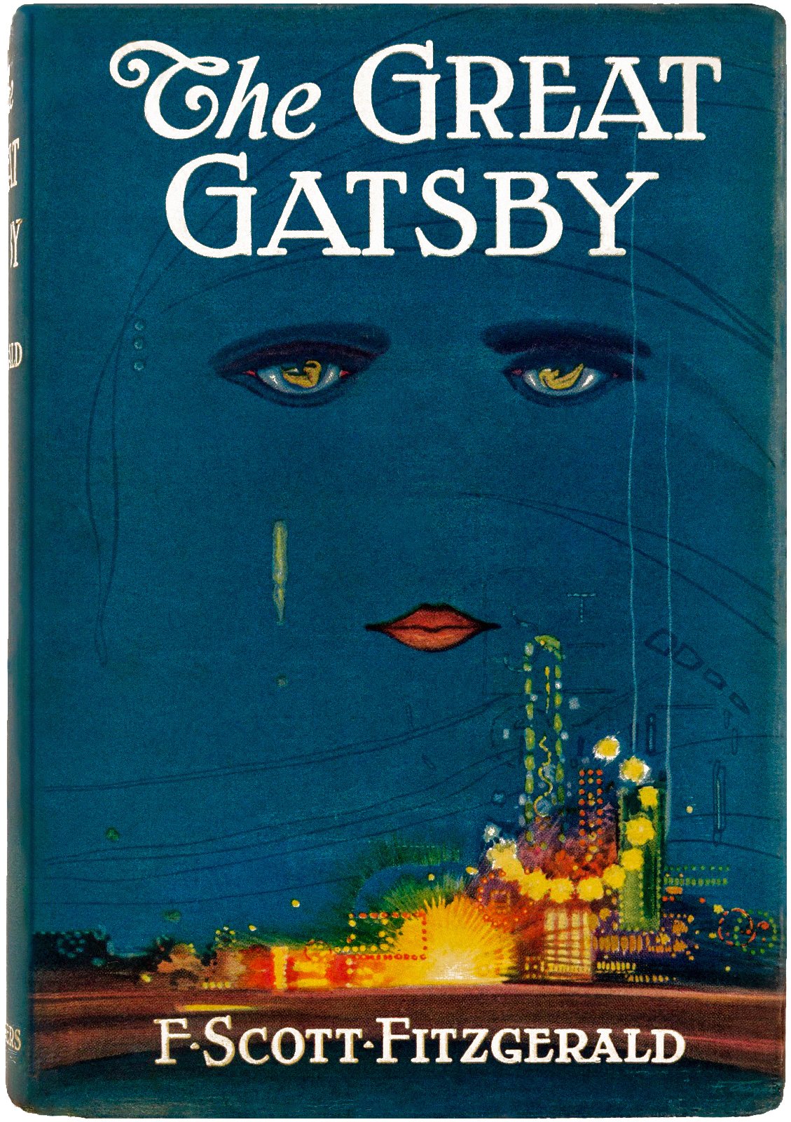
Francis Cugat’s haunting cover for The Great Gatsby is instantly recognizable: two glowing eyes and bright lips float above a dark cityscape, like a ghost watching over the jazz age. This wasn’t just decoration—it became the soul of the book itself. Readers and critics have often said that this artwork feels like a secret window into Gatsby’s world of longing and heartbreak. The eyes, widely believed to symbolize Dr. T. J. Eckleburg’s billboard in the novel, add a layer of meaning that readers still debate today. Before Gatsby, covers were often generic or ornamental, but Cugat’s design made the cover inseparable from the story’s emotional impact. Publishers noticed that readers connected more deeply with books that had distinctive visual identities. This cover’s enduring influence can be seen in how it still pops up on t-shirts, posters, and new editions—proof that a single artistic vision can echo through generations.
Ulysses by James Joyce (1934 U.S. edition) – E. McKnight Kauffer
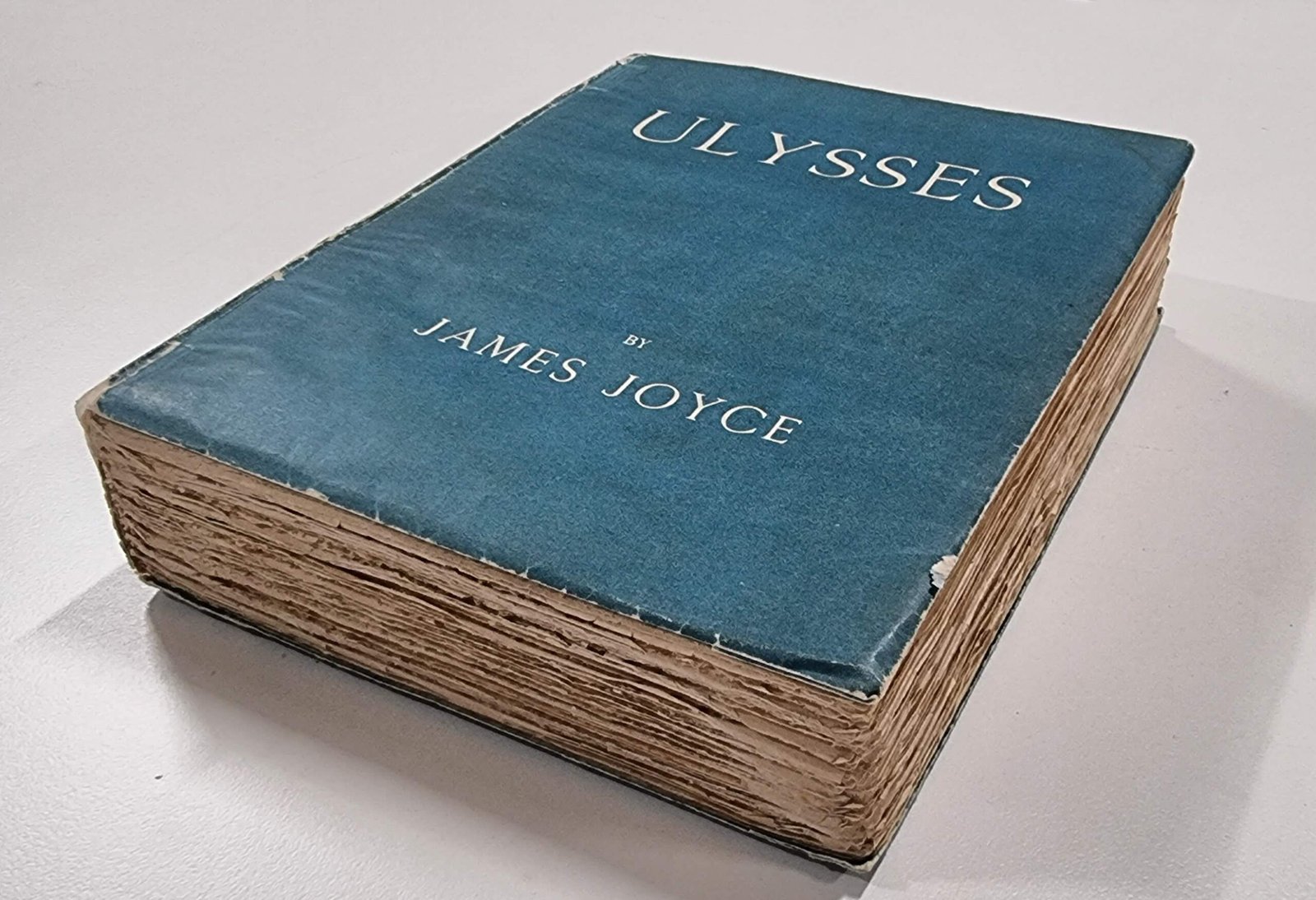
The 1934 U.S. edition of Ulysses featured a cover by E. McKnight Kauffer that broke every rule before it. Instead of an ornate or literal image, Kauffer used bold, modernist shapes and crisp typography, drawing inspiration from Bauhaus and other avant-garde movements. This radical simplicity made the book look more like a piece of modern art than a dusty classic. Design historians credit Kauffer’s work for opening the door to abstraction and minimalism in publishing. His approach was bold at the time, but soon became a blueprint for other designers aiming to match books with the cutting edge of visual culture. The cover’s geometric clarity mirrored Joyce’s complex, challenging prose, suggesting sophistication and modernity. In classrooms and design studios, this cover is still referenced as a turning point where book design stopped being just wrapping—and started being art.
The Catcher in the Rye (1951) – E. Michael Mitchell
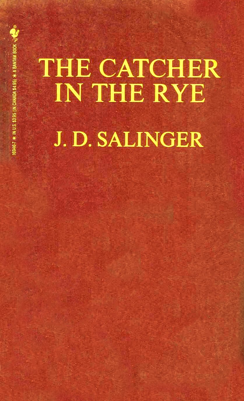
E. Michael Mitchell’s cover for The Catcher in the Rye is simple: a sketch of a carousel horse in vivid red, drawn with loose, expressive lines. But it’s that very simplicity that packs a punch. The horse evokes Holden Caulfield’s innocence and yearning for a lost childhood, while the red pops off the shelf with rebellious energy. This was one of the first times a hand-drawn, understated illustration became the emotional anchor for a best-selling novel. The impact was immediate—publishers saw that readers responded powerfully to symbolic, rather than literal, imagery. The cover’s minimalism was a stark contrast to the detailed book jackets popular at the time, and it soon inspired a wave of similarly stripped-back designs. Critics have praised the cover for its emotional honesty, saying it “lets the white space do the talking.” Even decades later, the image remains a touchstone for designers aiming to capture a book’s heart without giving everything away.
On the Road by Jack Kerouac (1957) – Roy Kuhlman

Roy Kuhlman’s design for On the Road tossed out the rulebook. Instead of showing beatniks or highways, he opted for abstract bursts of color and shape, echoing the freedom and chaos of Kerouac’s prose. This was more than just a style choice—it was a declaration that covers could be about feeling, not just plot. Kuhlman’s boldness helped usher in an era where book covers became canvases for experimentation. Publishers began to realize that the right cover could capture the spirit of a book at a glance, drawing in readers who felt the same spark of rebellion. Art critics and historians often cite this cover as the start of a more expressive, less literal tradition in publishing design. Its influence is still felt today, wherever designers dare to break with convention and trust emotion over explanation. The result? A cover that feels as alive and restless as the story itself.
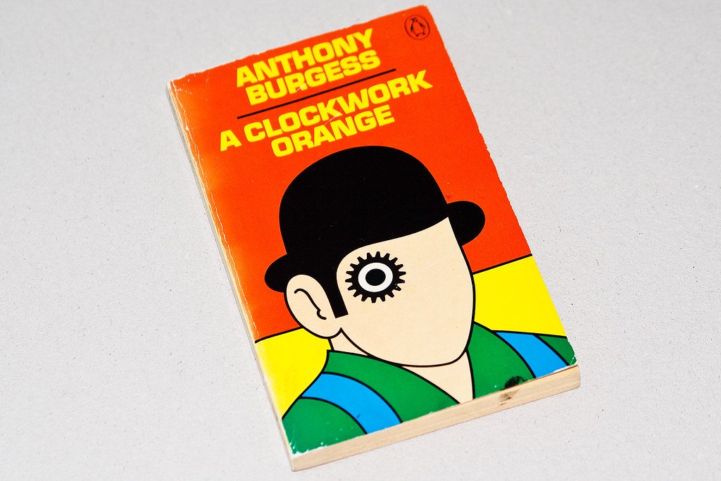
A Clockwork Orange (1972 edition) – David Pelham

David Pelham’s 1972 cover for A Clockwork Orange is unforgettable: a stark, cartoonish face with a cog for an eye stares out, both mechanical and human. The image is unsettling, perfectly matching the novel’s disturbing vision of a future gone wrong. Pelham’s use of bold lines and a limited palette launched a new wave of dystopian aesthetics—gritty, graphic, and instantly recognizable. The design quickly became a pop culture symbol, referenced in everything from album art to graffiti. Critics note that this cover didn’t just sell books; it set the visual tone for an entire genre. Suddenly, sci-fi and punk novels wanted to look like this—edgy, minimal, and slightly dangerous. The cog-eyed face is still used in movie posters and merchandise, a testament to its staying power. Pelham’s cover proved that a single, striking image could create a brand as powerful as any marketing campaign.
The Godfather (1969) – S. Neil Fujita

S. Neil Fujita’s cover for The Godfather introduced the now-legendary puppet strings motif, cleverly tying together the themes of power, manipulation, and fate. The simple black-and-white design, with its dramatic use of shadow and bold typography, was a departure from the crowded, illustrative covers of the era. By merging image and text, Fujita created a visual shorthand for the entire story—a family controlled from above, like marionettes on a stage. Publishers and studios soon realized the power of such branding: the puppet strings became synonymous with The Godfather, reappearing in film posters, sequels, and even parodies. Marketing experts point to this cover as a case study in how a book can become a cultural icon before it even hits the big screen. Fujita’s work made it clear that design wasn’t just about selling books, but about building a mythos that could last for generations.
Jaws by Peter Benchley (1974) – Roger Kastel
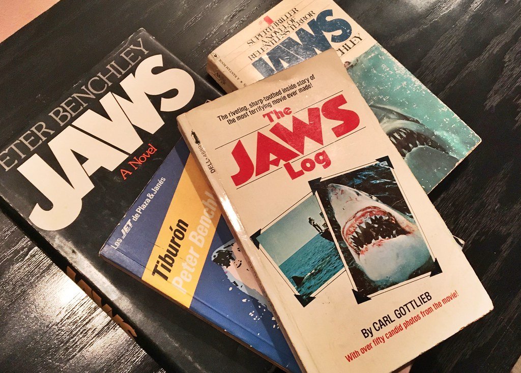
Roger Kastel’s cover for Jaws is simple, but it’s impossible to forget: a gigantic shark rises from the deep, mouth wide open, toward an unsuspecting swimmer. With just two elements, the design creates instant dread—a primal fear that made people think twice before swimming in the ocean. The cover’s success was immediate, driving book sales to new heights and helping pave the way for blockbuster tie-ins. Kastel’s work is often cited as the moment when publishers realized the power of visual storytelling in marketing genre fiction. The image was used on movie posters and became a template for thrillers everywhere: minimal, menacing, and direct. Industry analysts credit Jaws with changing the way publishers approached book marketing, making the cover as important as the story inside. Even today, the “shark from below” layout is a go-to for horror and suspense novels, proof of its lasting impact.
Penguin Books (1935 onwards) – Edward Young
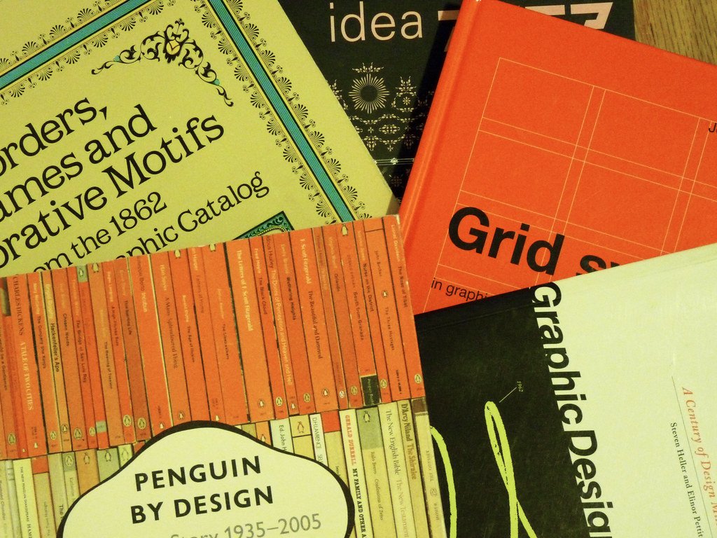
Edward Young’s design for Penguin Books didn’t feature a single image, but it turned publishing on its head. By introducing a simple system of colored bands—orange for fiction, green for crime, blue for biography—Young made it easy for readers to spot their favorite genres at a glance. This wasn’t just about looks; it was about making books accessible to everyone, with style. The clean, modern layout helped Penguin democratize reading, proving that affordable paperbacks could be beautifully designed. Historians often say that Young’s color bands were the first true “branding” in publishing, copied by companies around the world. The design created a sense of trust and familiarity, so readers could buy with confidence. Even today, the Penguin bands are a symbol of quality and innovation, showing that great design can be both functional and iconic.
The Bell Jar (Faber, 1966 edition) – Shirley Tucker

Shirley Tucker’s cover for The Bell Jar is quiet, but powerful. Instead of a dramatic scene or portrait, she chose a minimalist approach: gentle typography and muted tones that echo Sylvia Plath’s introspective, haunting prose. The design’s restraint gives it a sense of intimacy and vulnerability, inviting the reader into the protagonist’s fragile world. Critics and fans alike have praised the cover for capturing the novel’s mood without shouting for attention. Tucker’s work influenced a wave of minimalist covers in the literary world, proving that sometimes less really is more. The understated elegance of the design made it a favorite among readers who wanted their books to feel personal and meaningful. Even decades later, her approach is considered a gold standard for aligning cover art with a book’s emotional core.
Infinite Jest by David Foster Wallace (1996) – Michael Pietsch
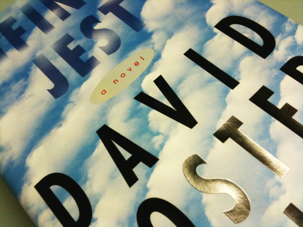
Michael Pietsch’s design for Infinite Jest broke away from the image-heavy covers of its era, putting bold typography front and center against a surreal, cloud-filled sky. The oversized title, clear and assertive, signaled the book’s ambition and complexity before readers even opened the first page. This return to text-forward design was a breath of fresh air in the crowded world of literary fiction. Pietsch’s choice of sky imagery, both calming and infinite, hinted at the novel’s sprawling, layered themes. Design critics point out that this cover marked a new wave of postmodern book design, where words and images played equal roles. The influence of Infinite Jest’s cover can be seen in many bestsellers that followed, as publishers realized readers responded to strong, conceptual visuals. The result? A cover that’s as thought-provoking as the story it wraps.

CEO-Co-Founder
